REDESIGN OF OASE JOURNAL:
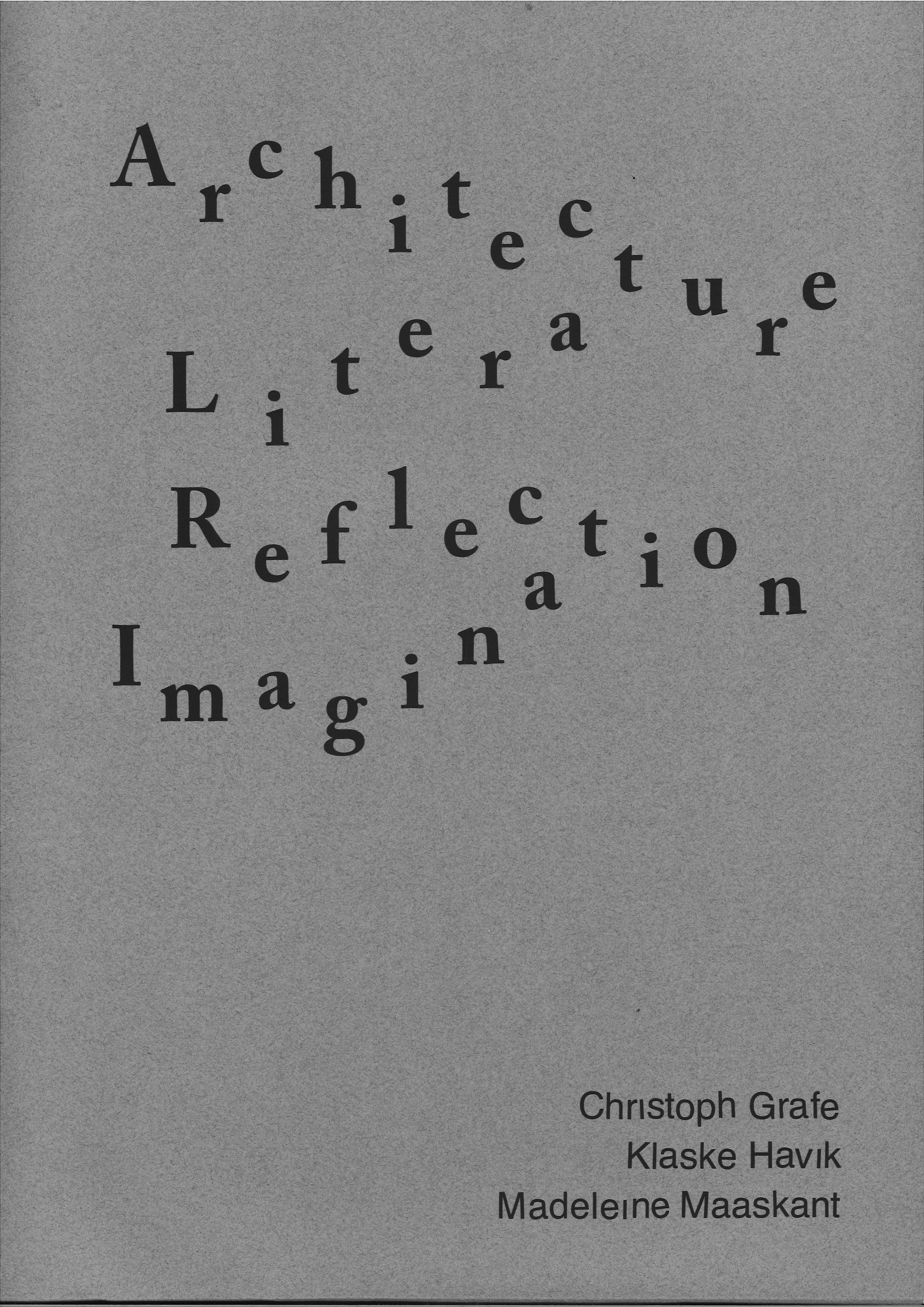
ARCHITECTURE & LITERATURE, REFLECTION & IMAGINATION
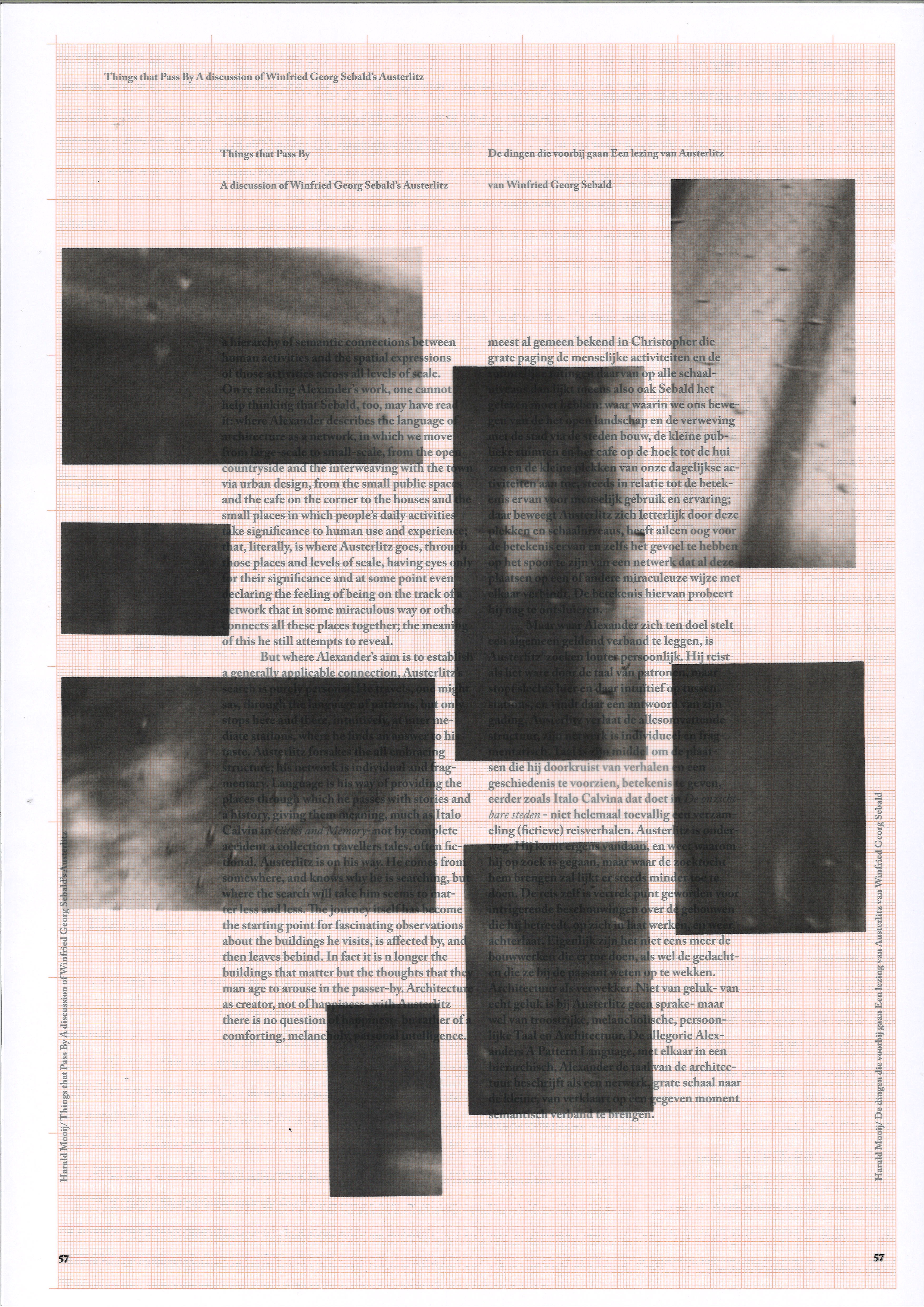
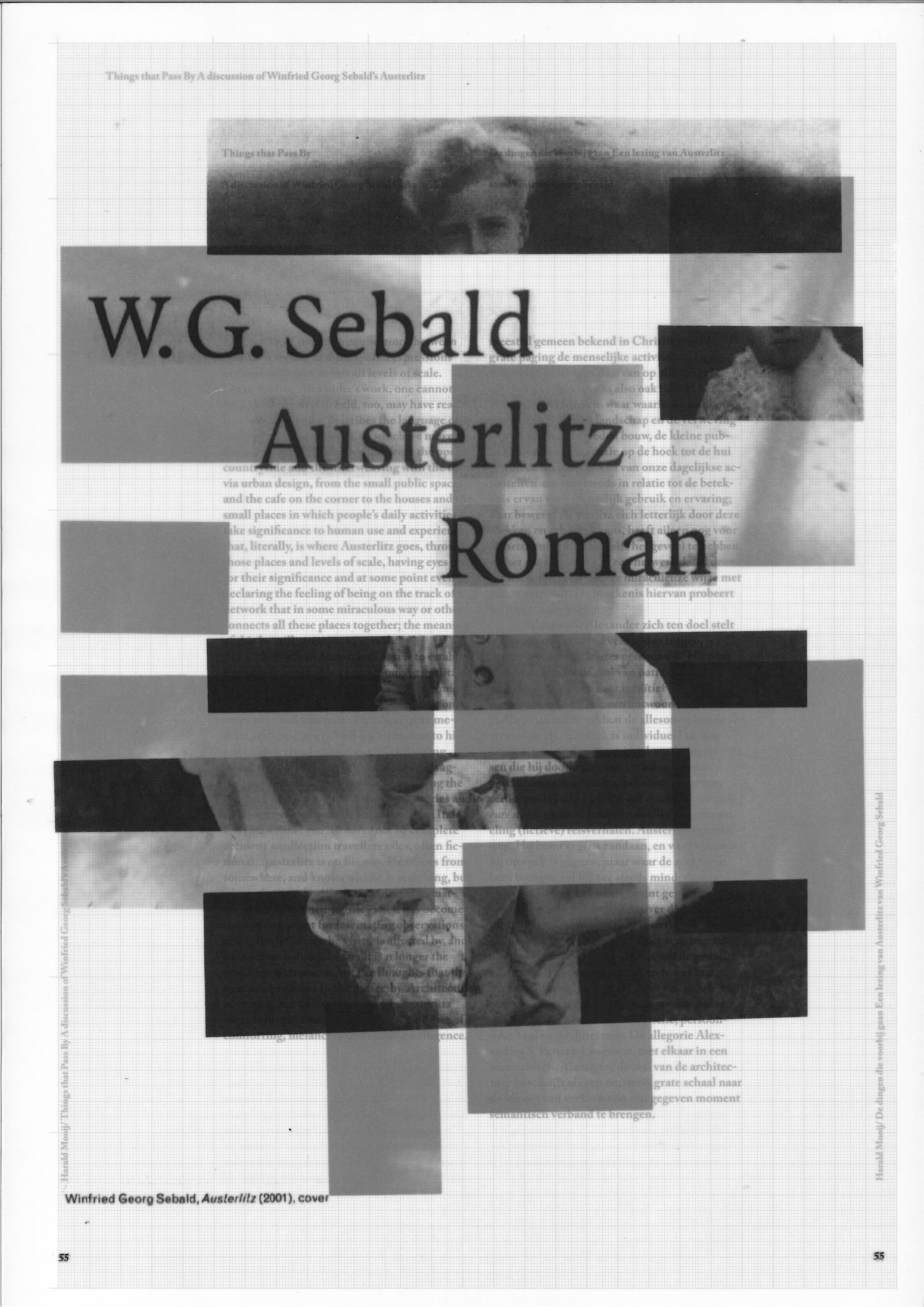
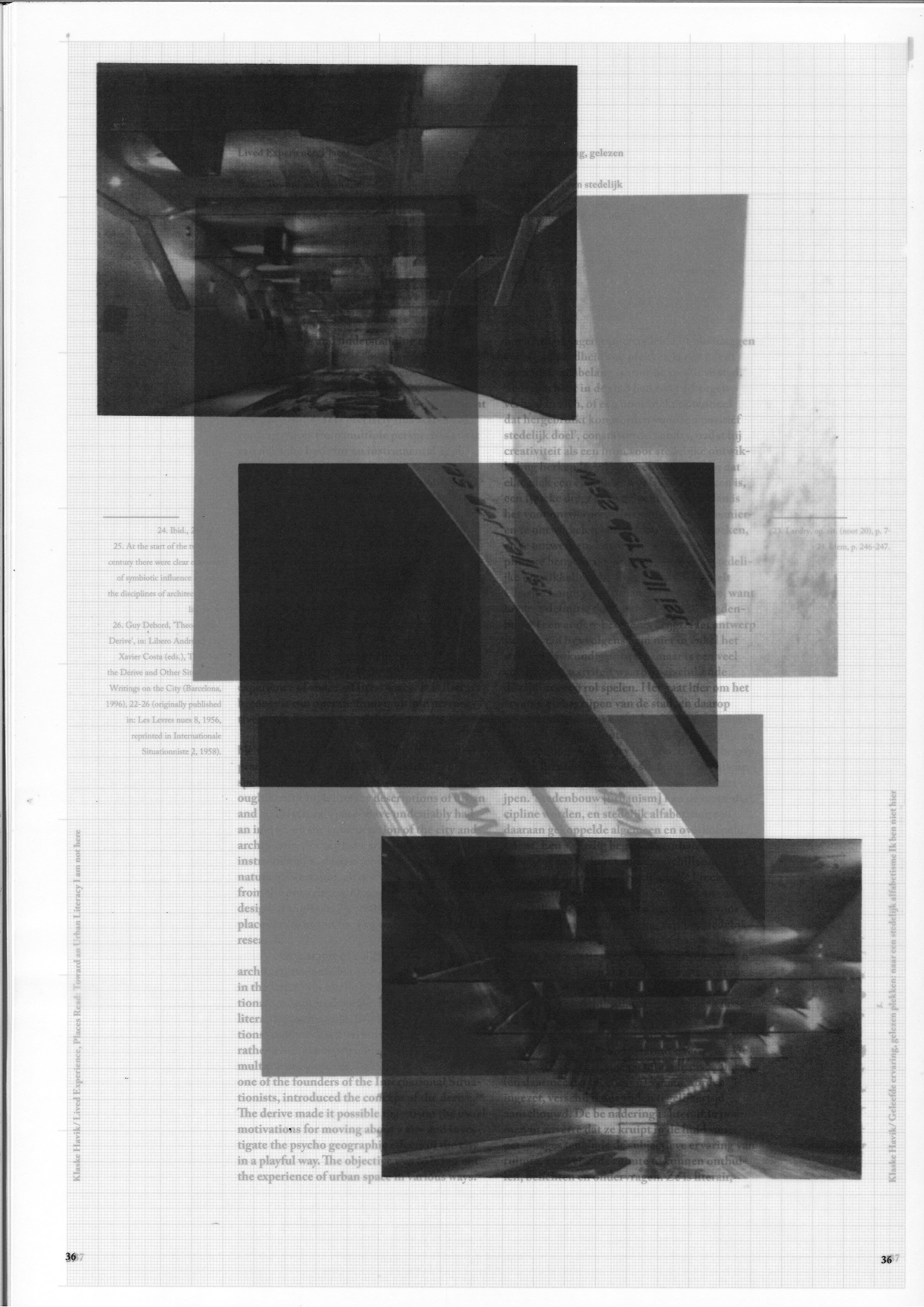
In this project, I redesigned the 70th issue of the OASE journal, which considers literary reflection as a component of architectural discourse, in which highly personal descriptions and narratives encourage us to look at architecture in a different way and to think what literary reflection can represent for architectural practice.
When working with this material, I had three main limitations:
- the book must be in two languages (Dutch and English);
- A3 format;
- unbound.
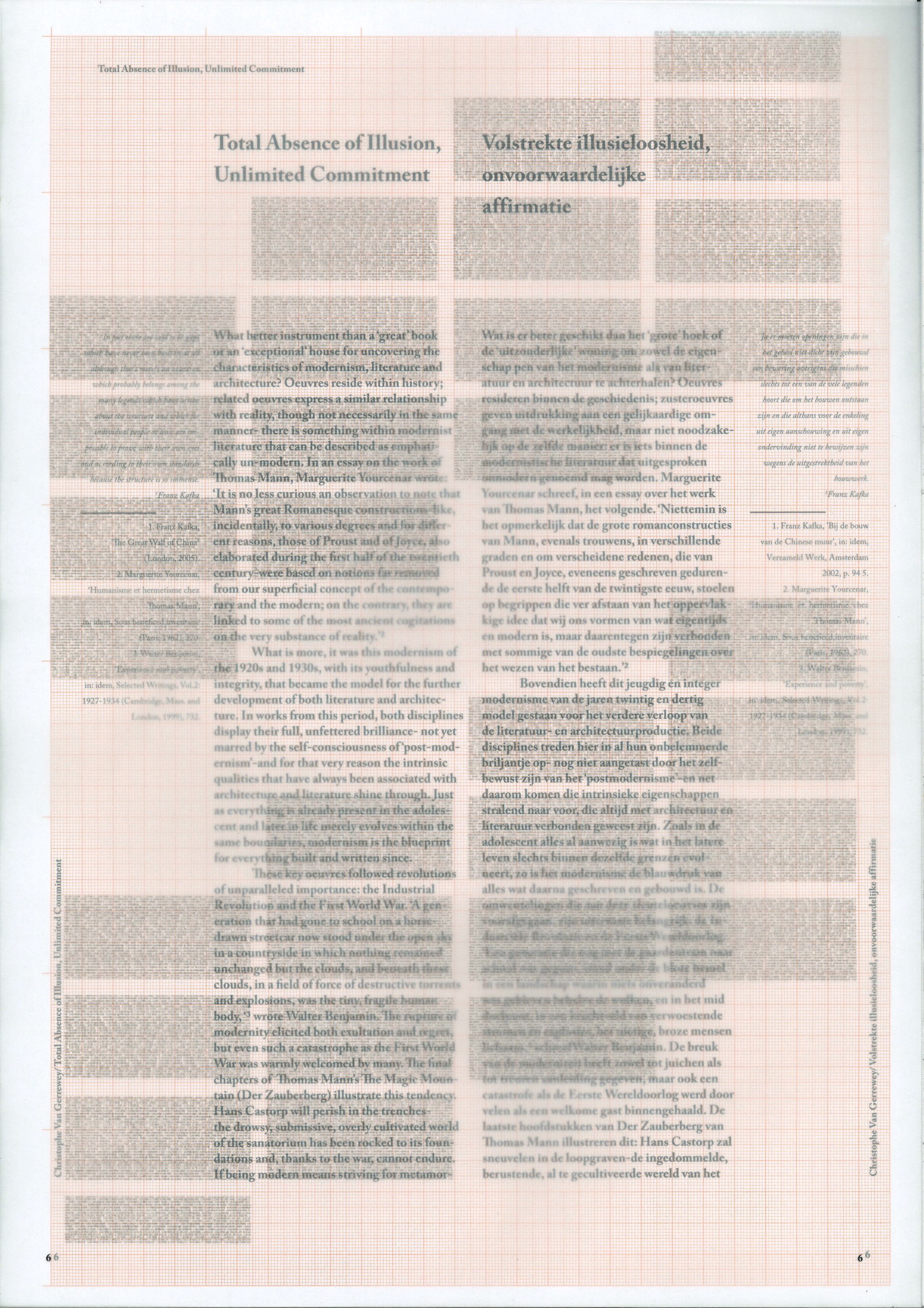
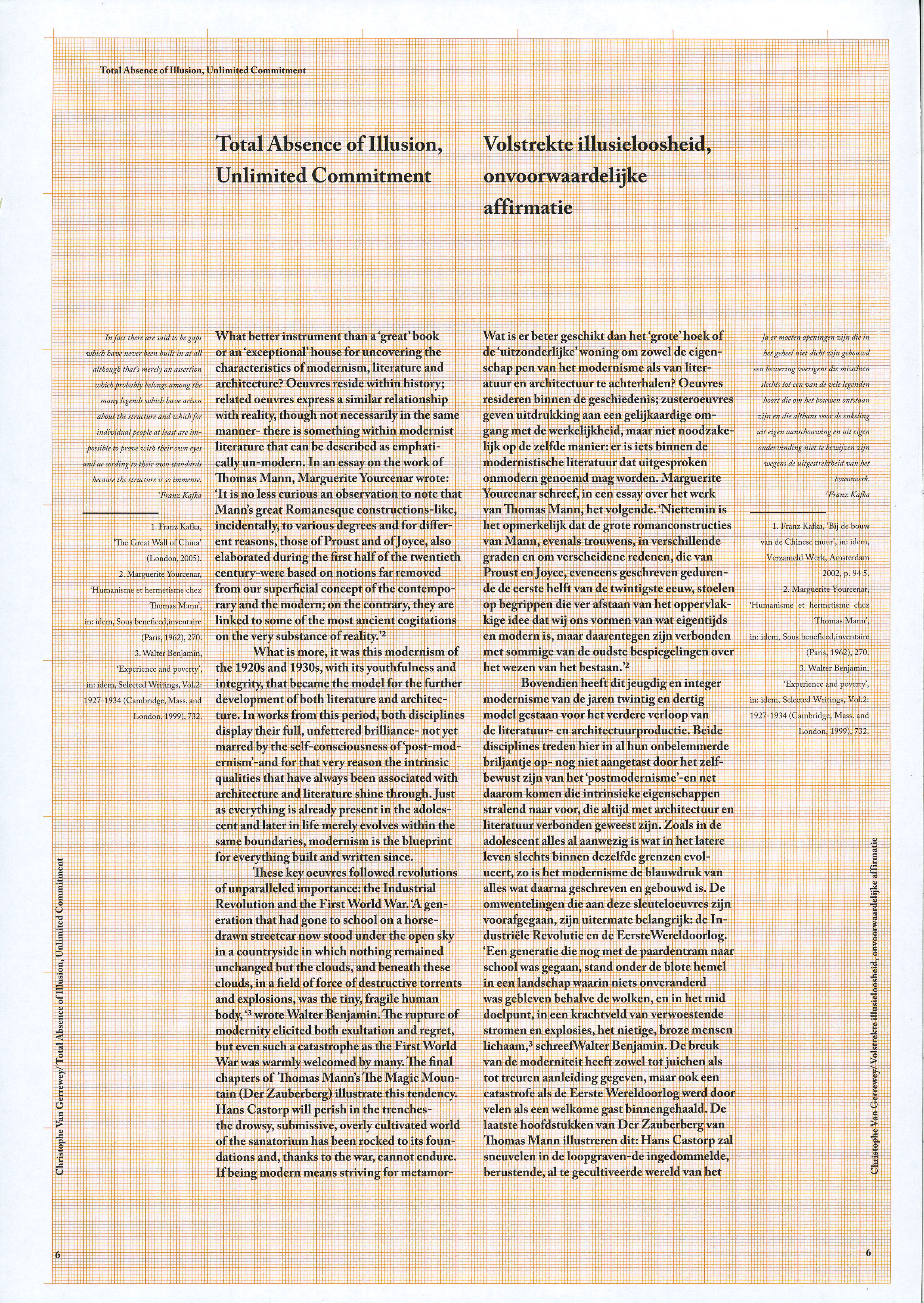
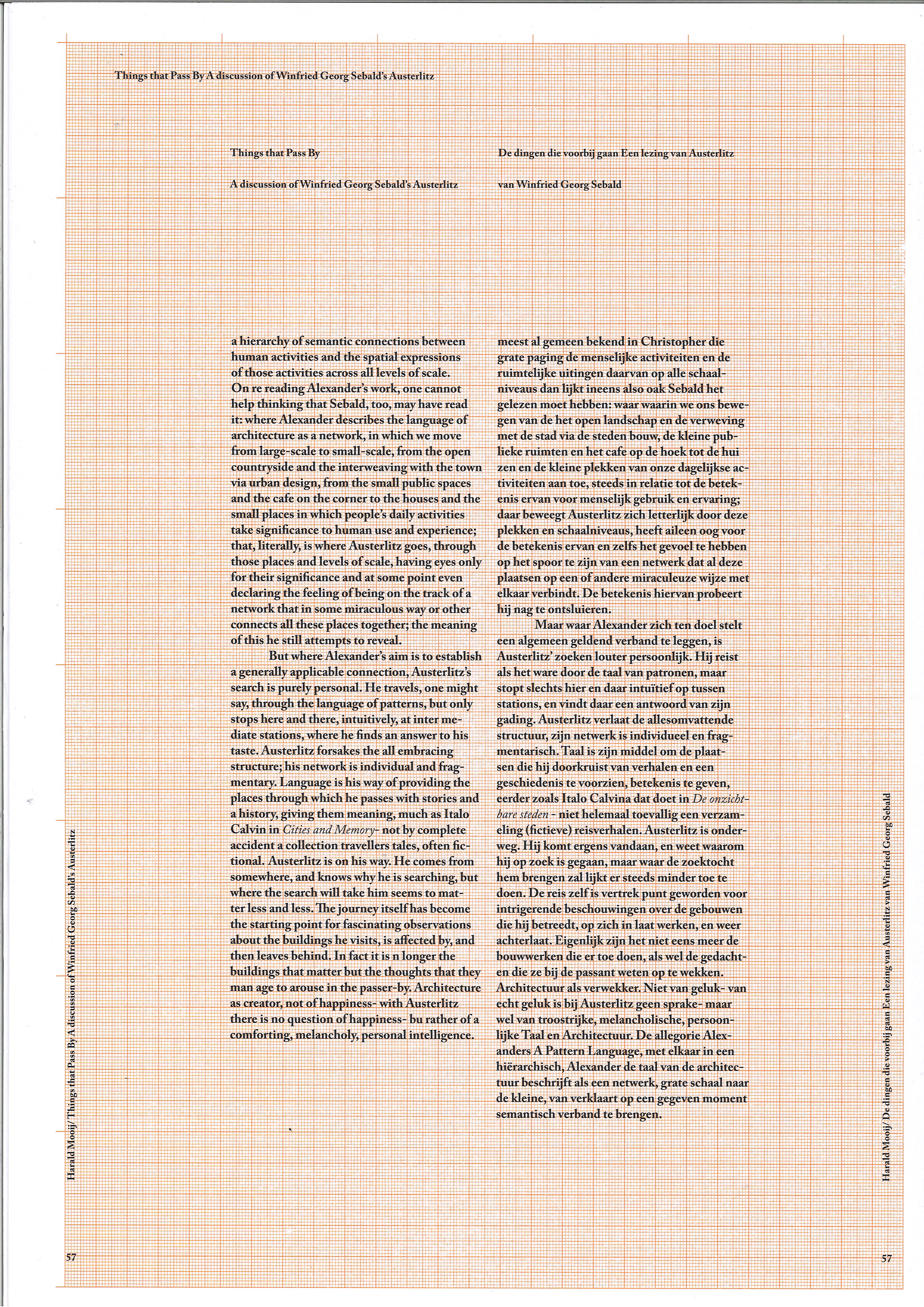
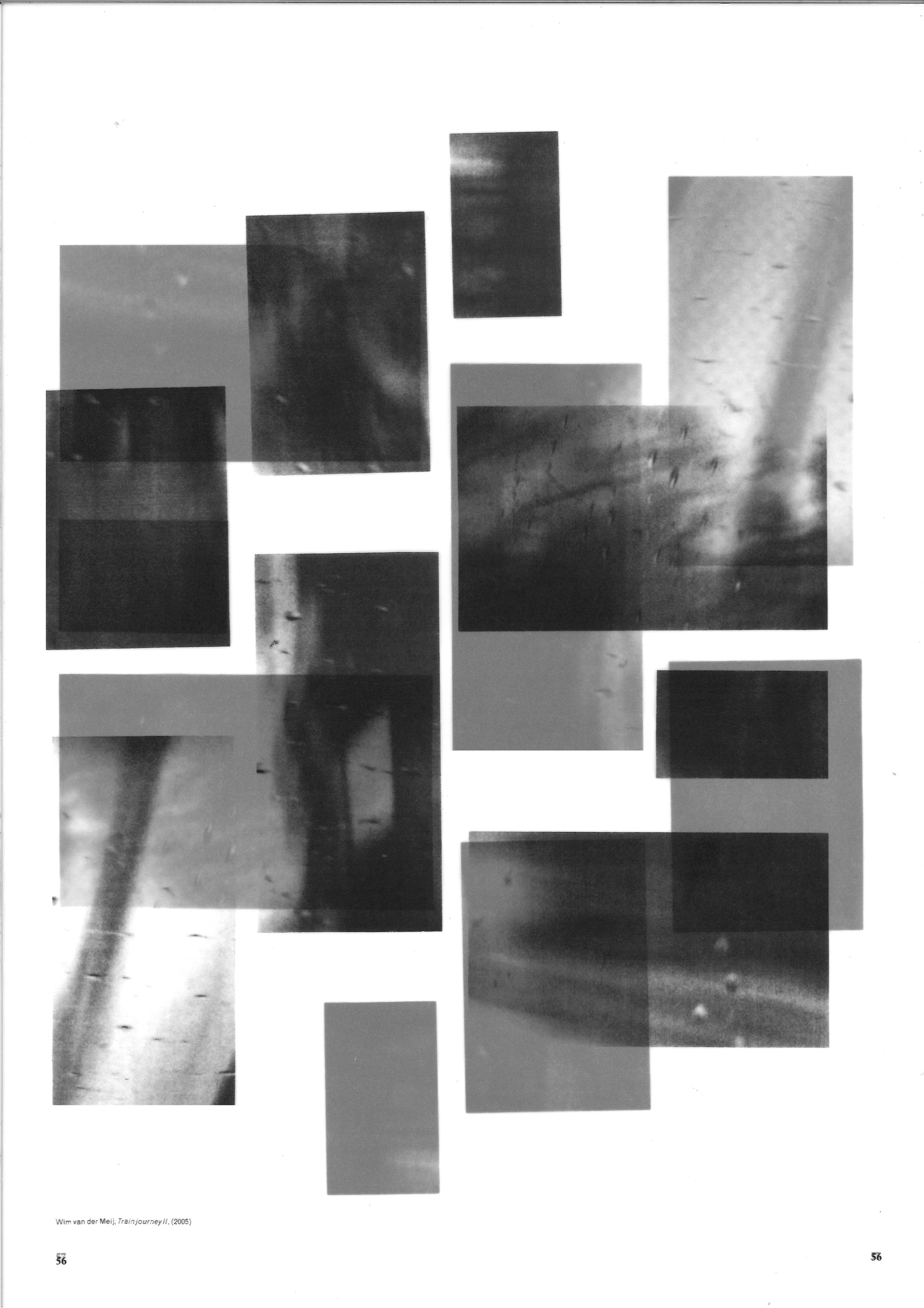
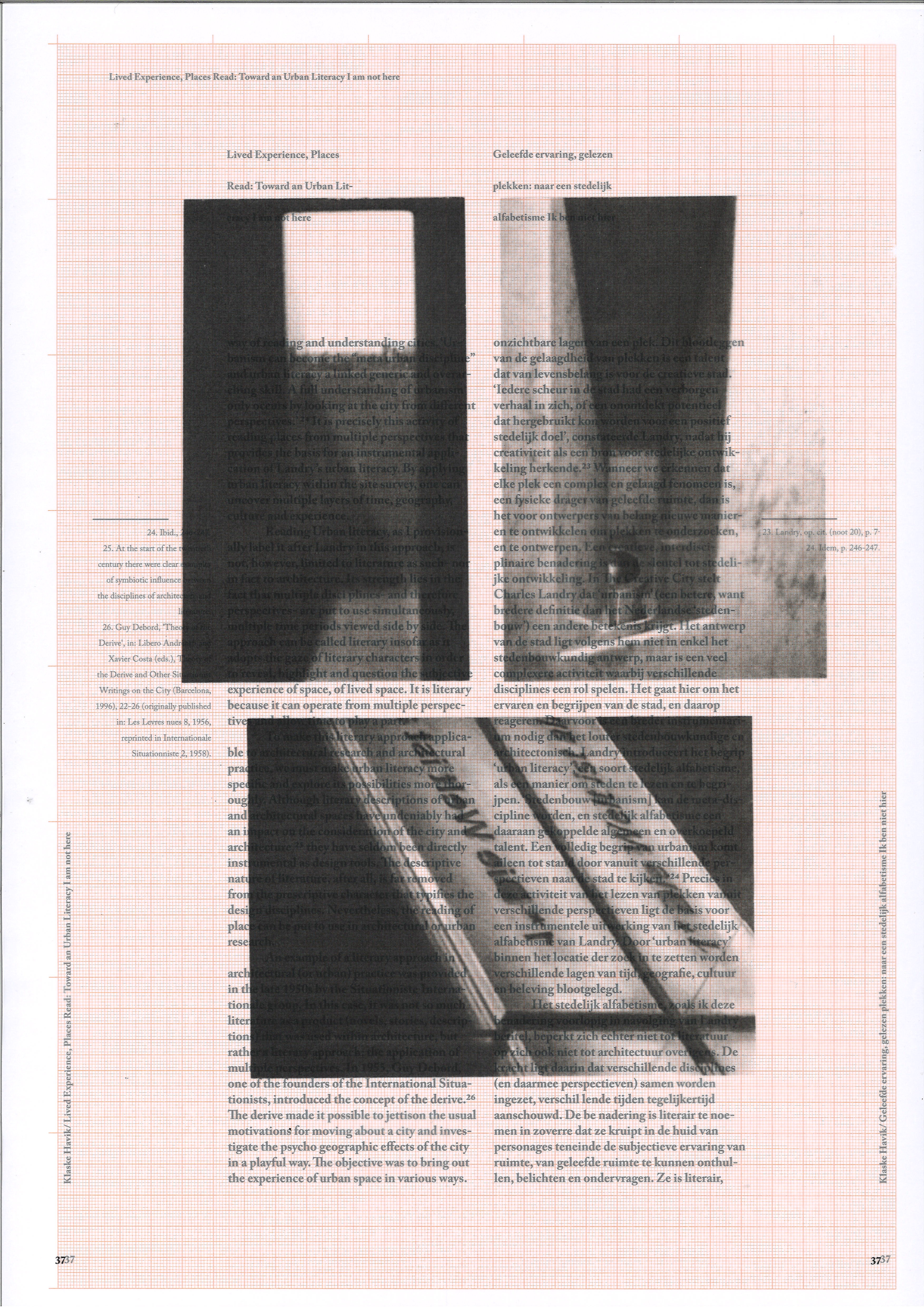
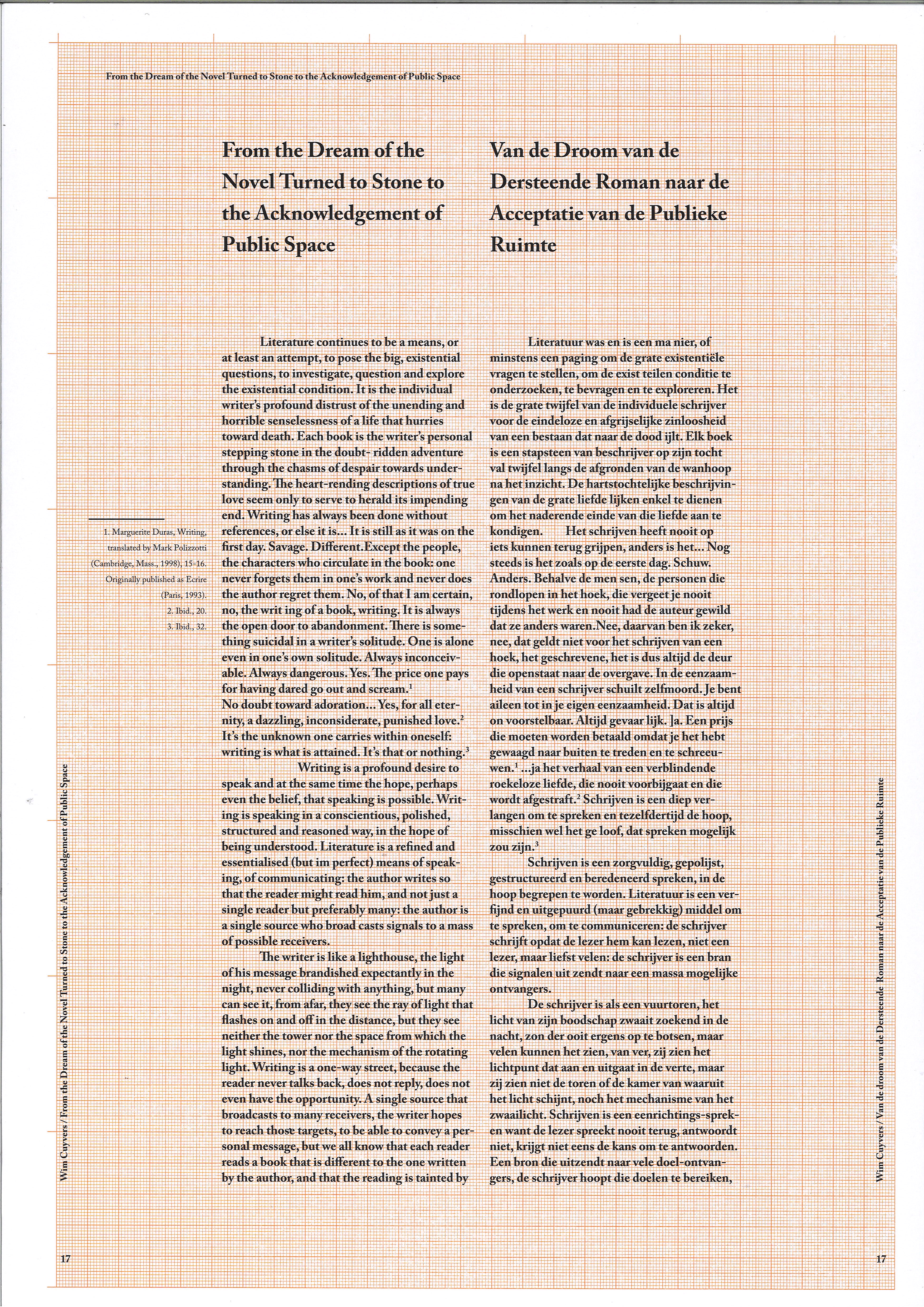
Based on all the restrictions, I came up with a concept in which the book will resemble an architect's folder with sketches, plans, drawings. Thus, the text content was printed on graph paper (also known as scale-coordinate paper), often used by architects for drawing schemes and technical plans. All images were printed on tracing paper and organized in compositions, visually resembling simplified architectural layouts.
In addition, working with such a limitation as “unbound”, I kept thinking about how to organize everything in such a way that if the book falls out of hands, it could be assembled as quickly as possible, so, the numbering of the text pages duplicates the page numbers of the image pages they refer to.
While working on the book, tactility was always important to me: three different types of paper - three different surfaces. For example, the grey slightly rough surface of the cover refers to stone or concrete materials, which are often used in construction.
