NEXT STREET FONT
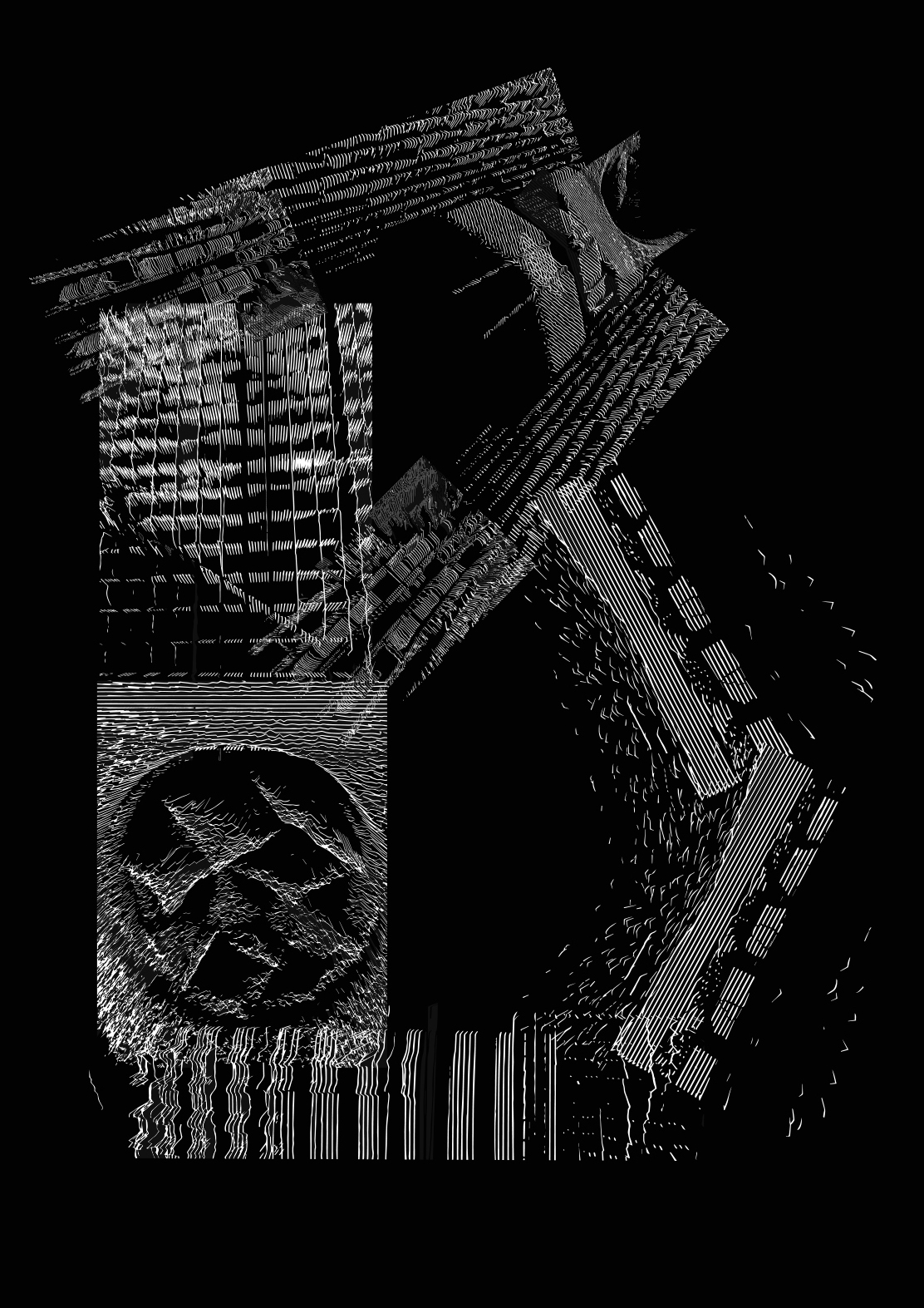
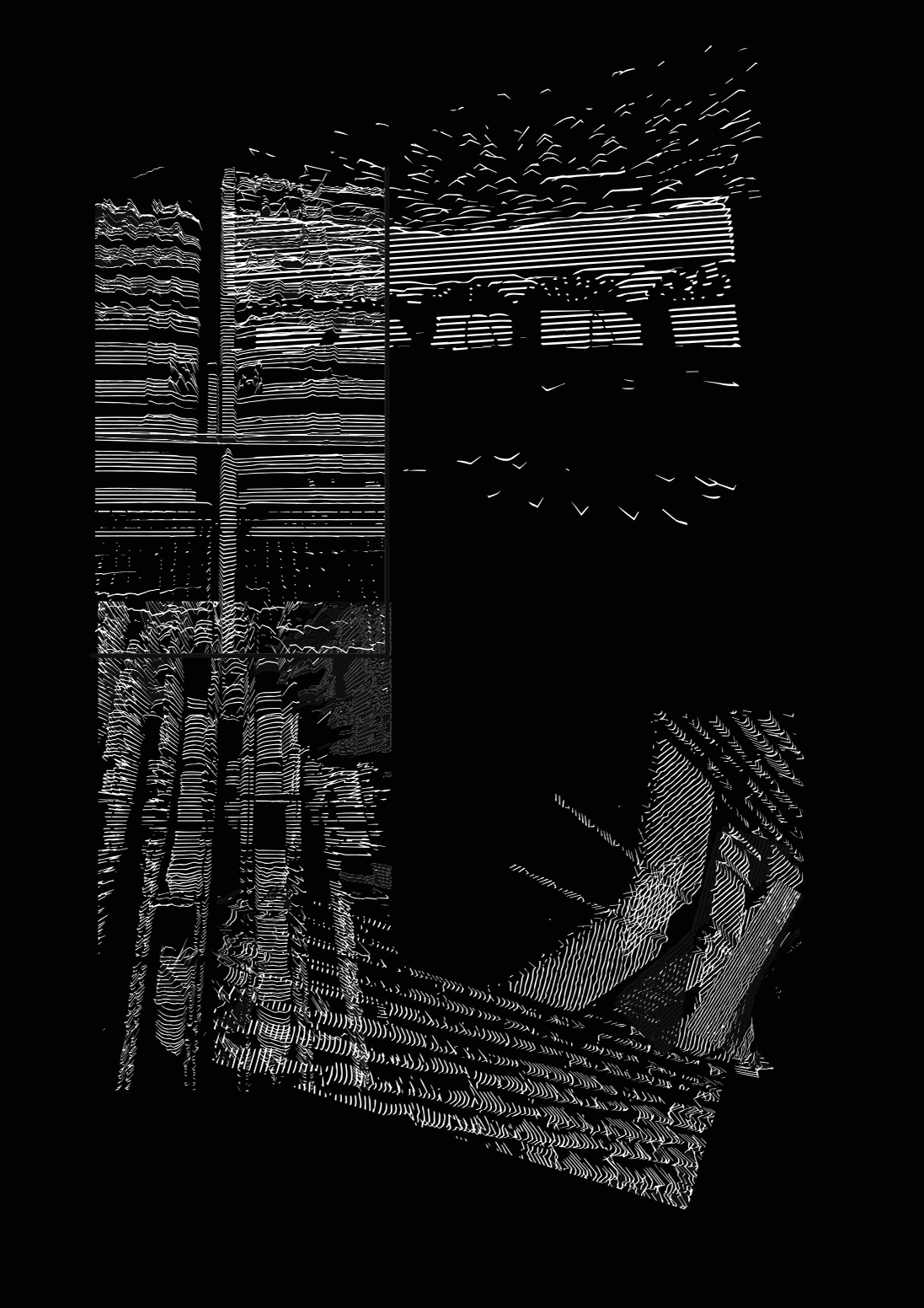
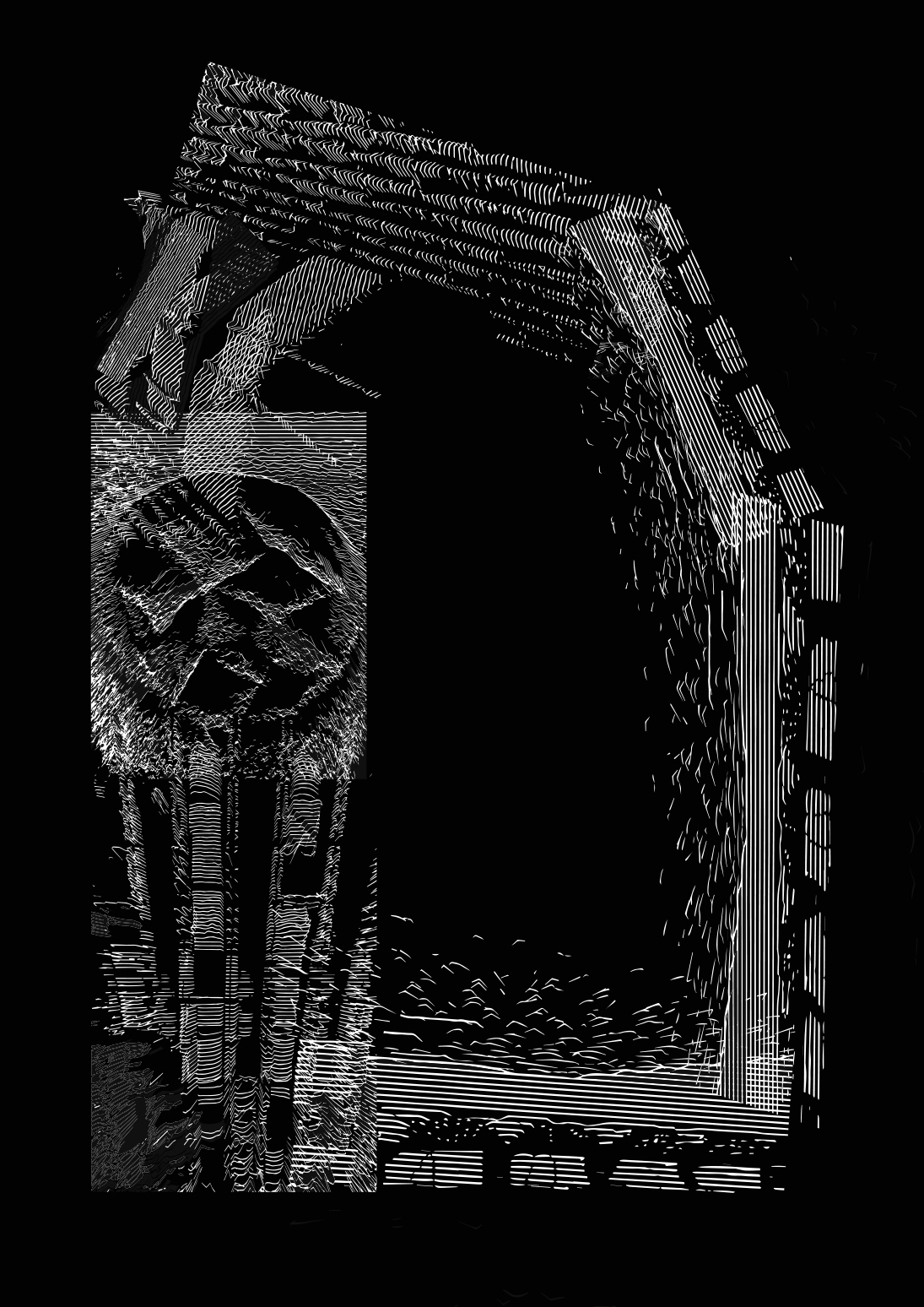
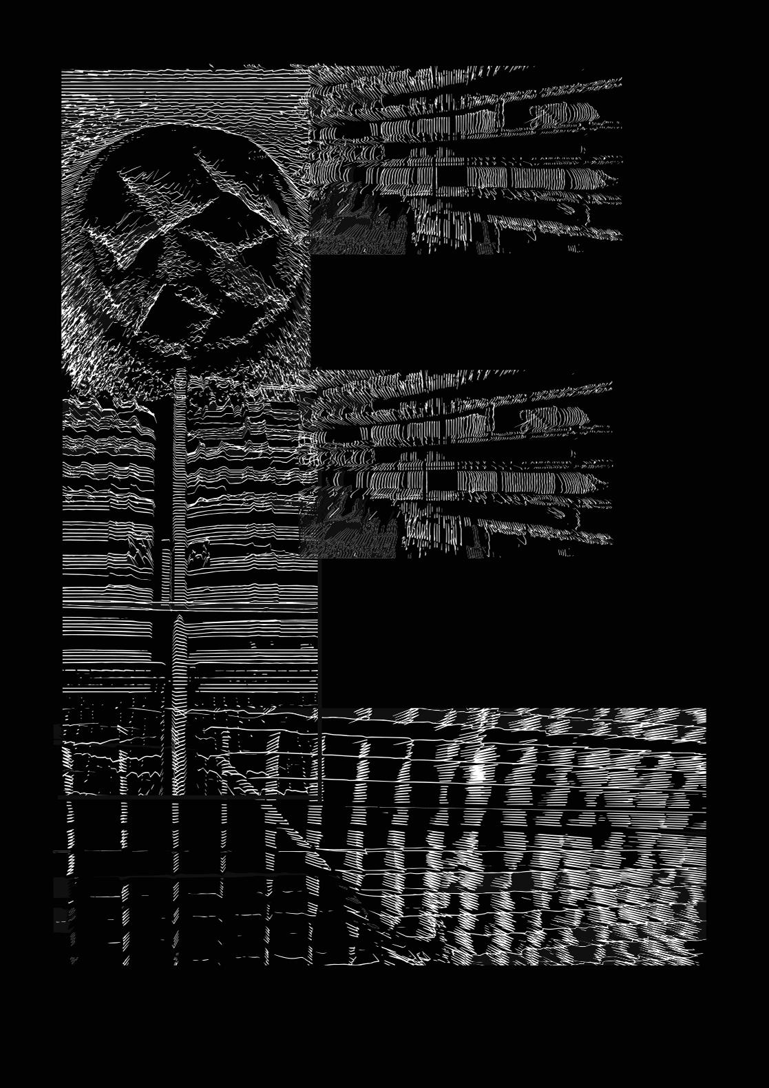
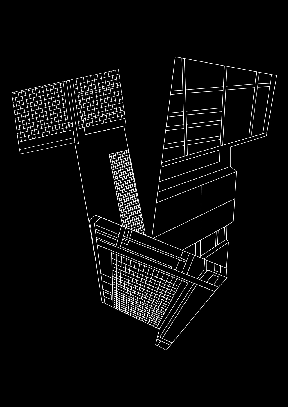
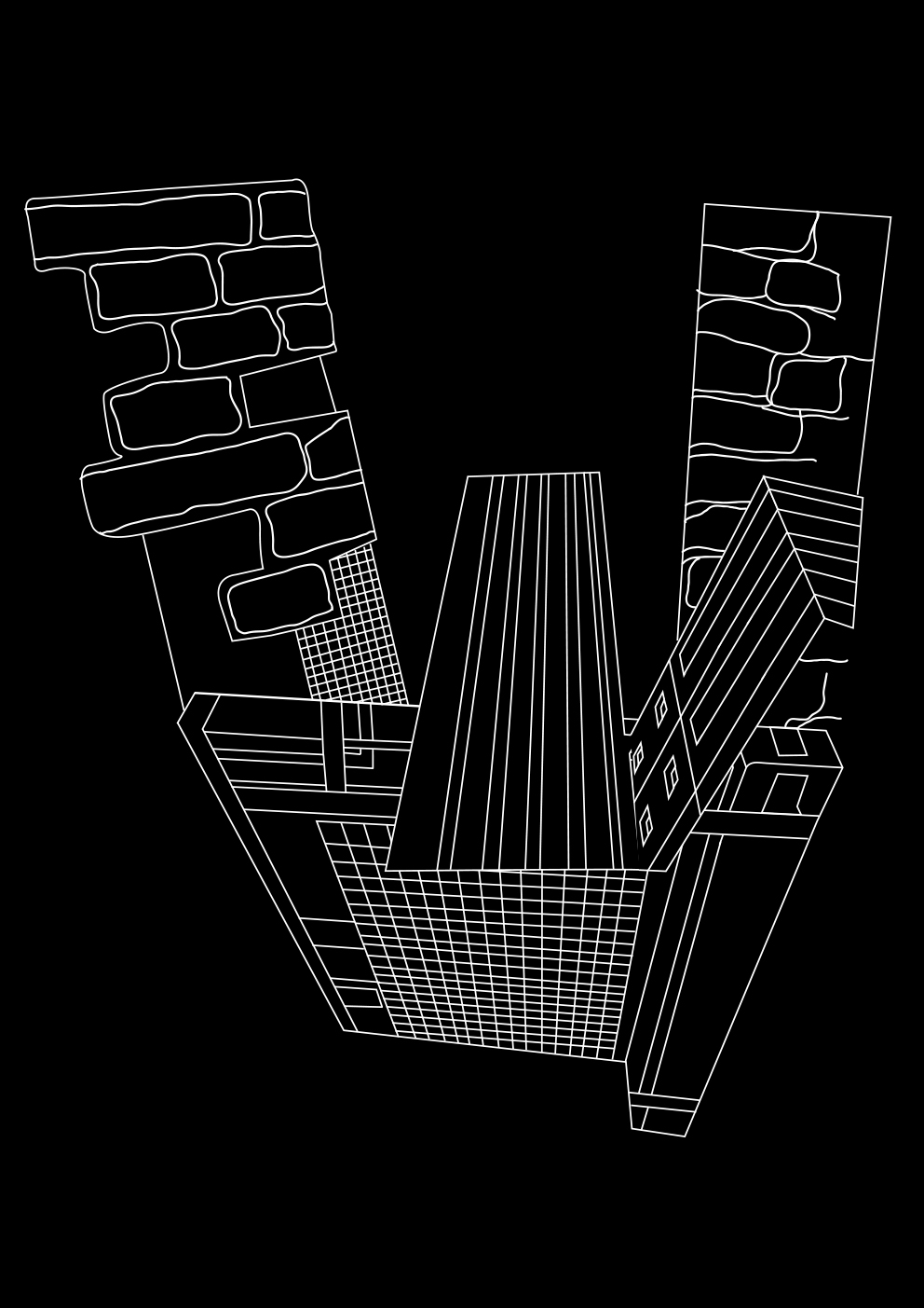
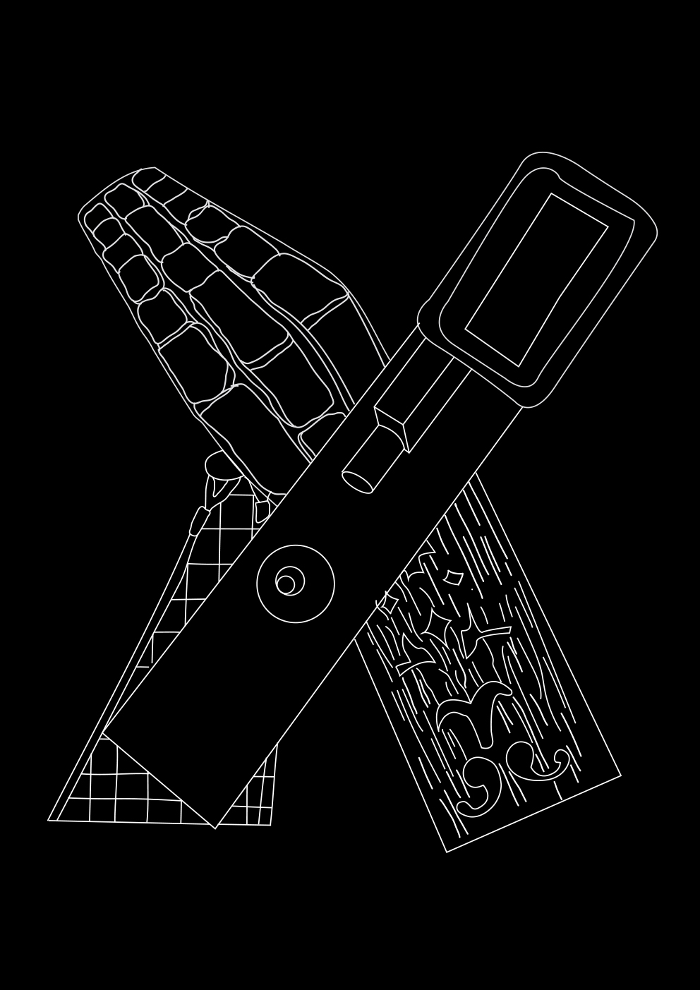
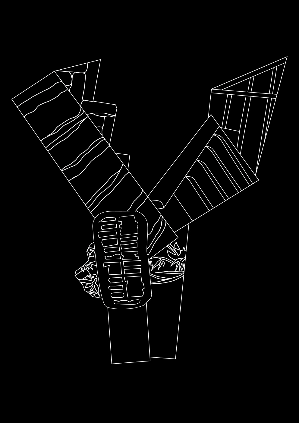
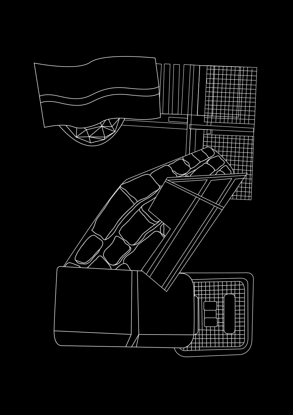
A parasite is an organism that lives on or inside a host and receives food from or at the expense of the host, being inspired by this apparently biological fact, I started to think how to translate this to graphic design. Every day I was passing through the next to my house street(simply, grocery shop was there), I started to notice how this street is covered with textures, located on absolutely different in style buildings - that was the moment I realized that the cladding of the buildings is the very parasites that I am looking for! Plenty of signs on this street led to the idea of creating a type out of them.
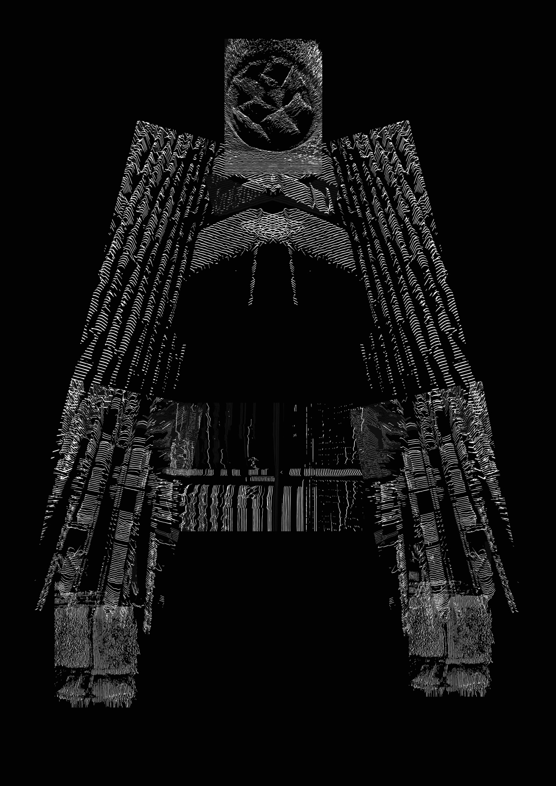
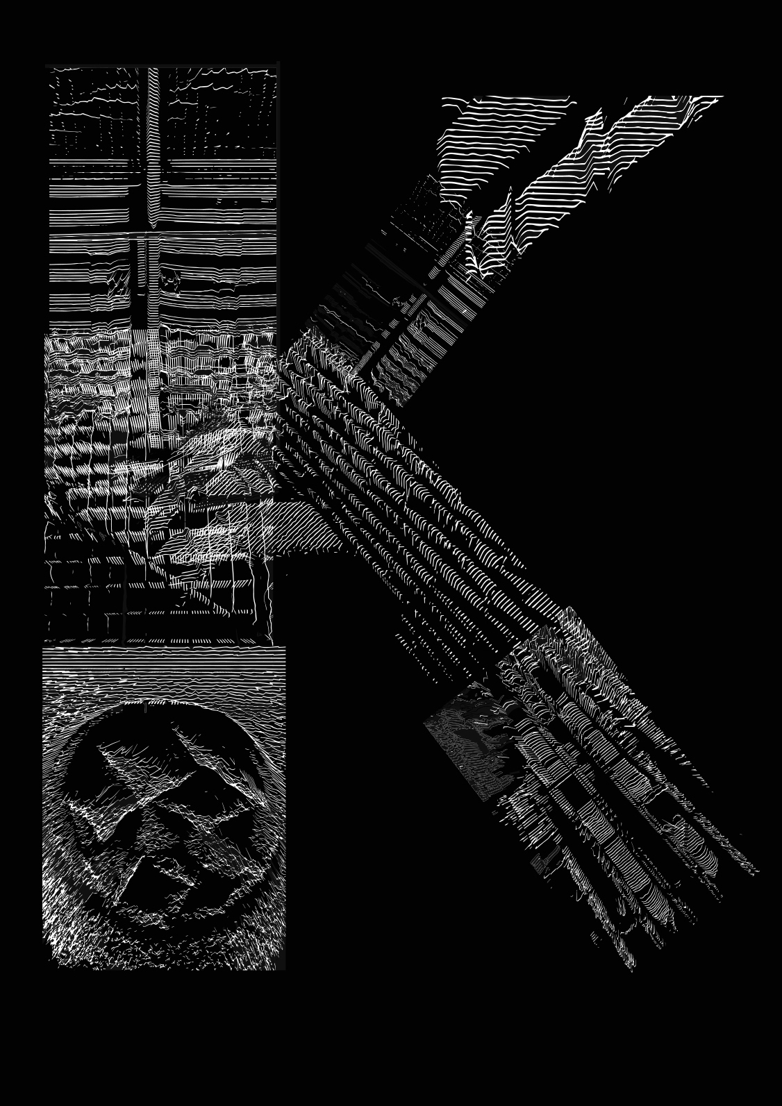
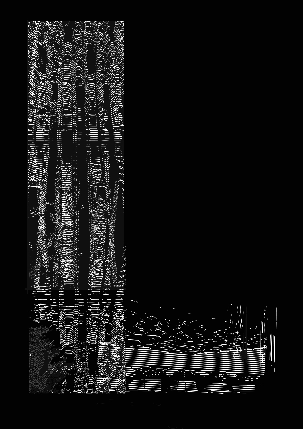
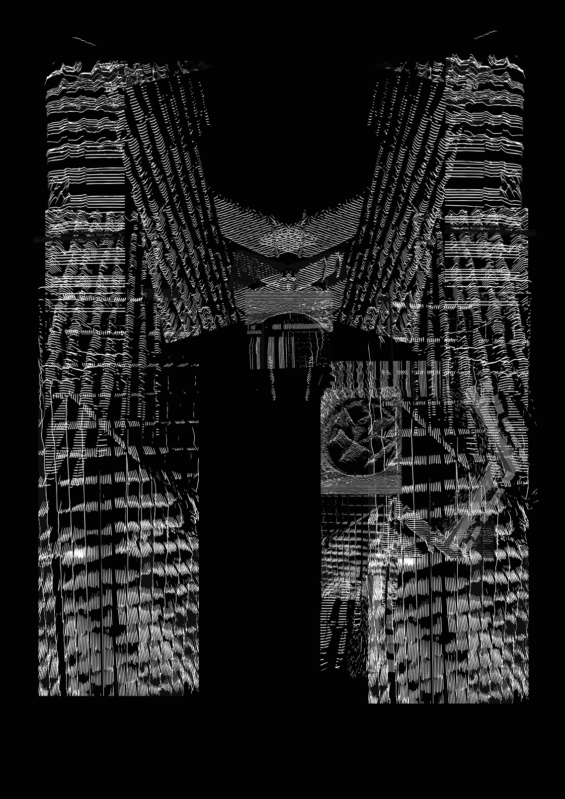
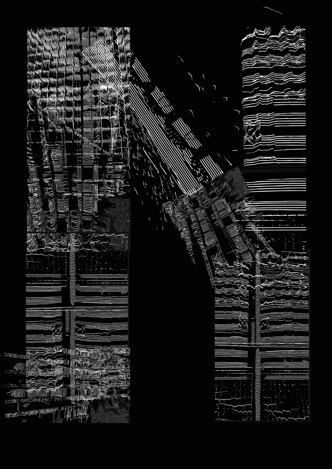
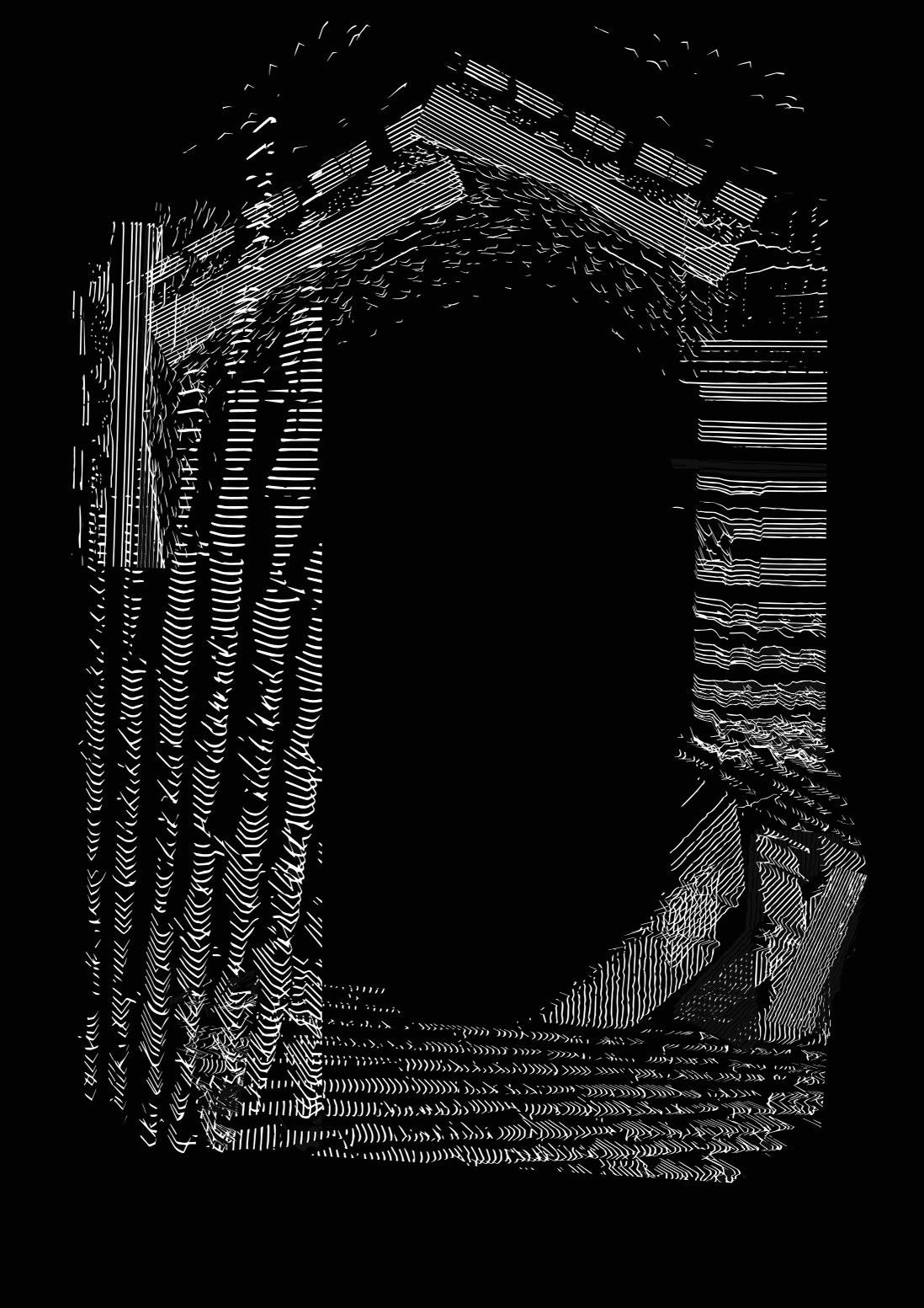
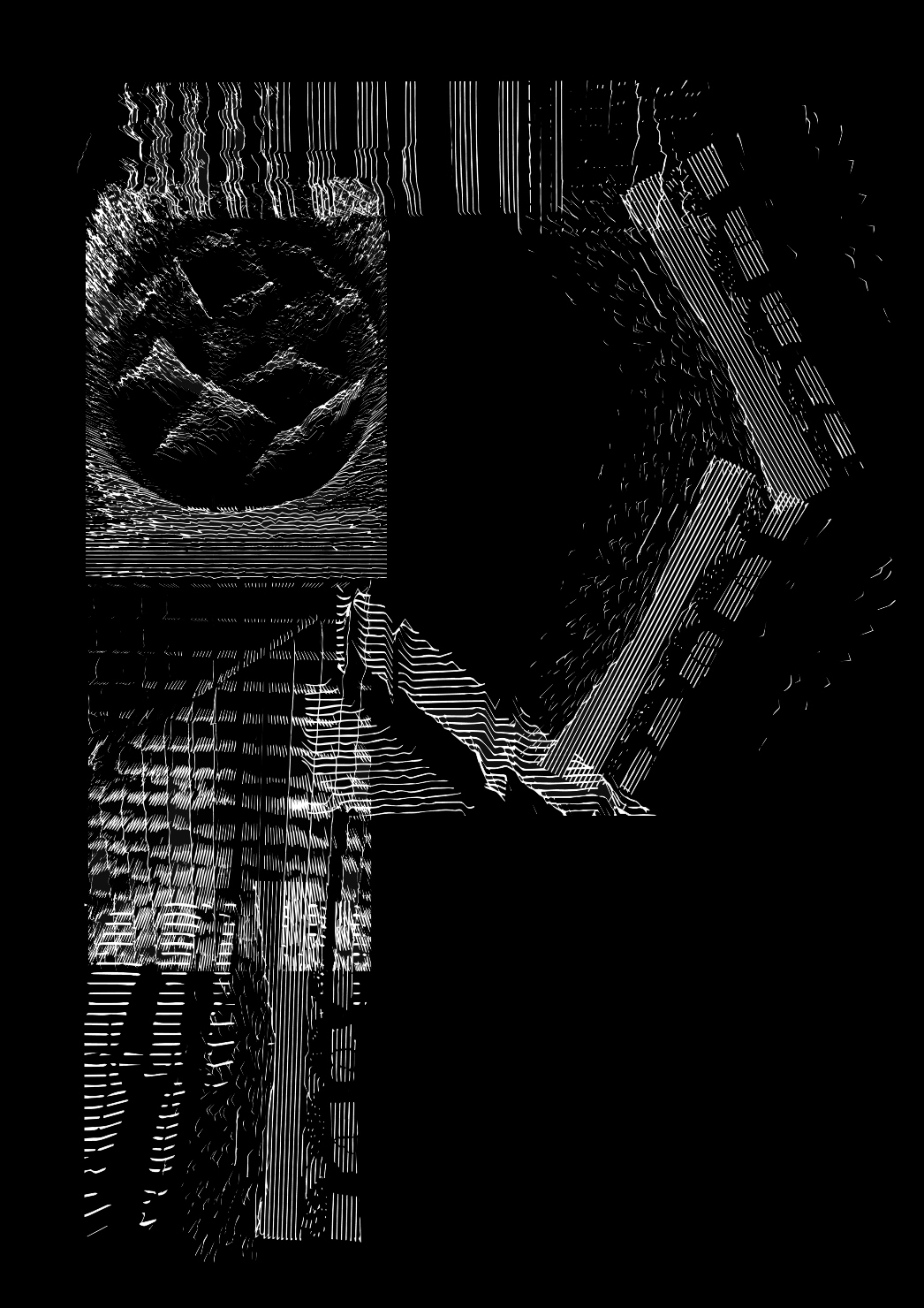
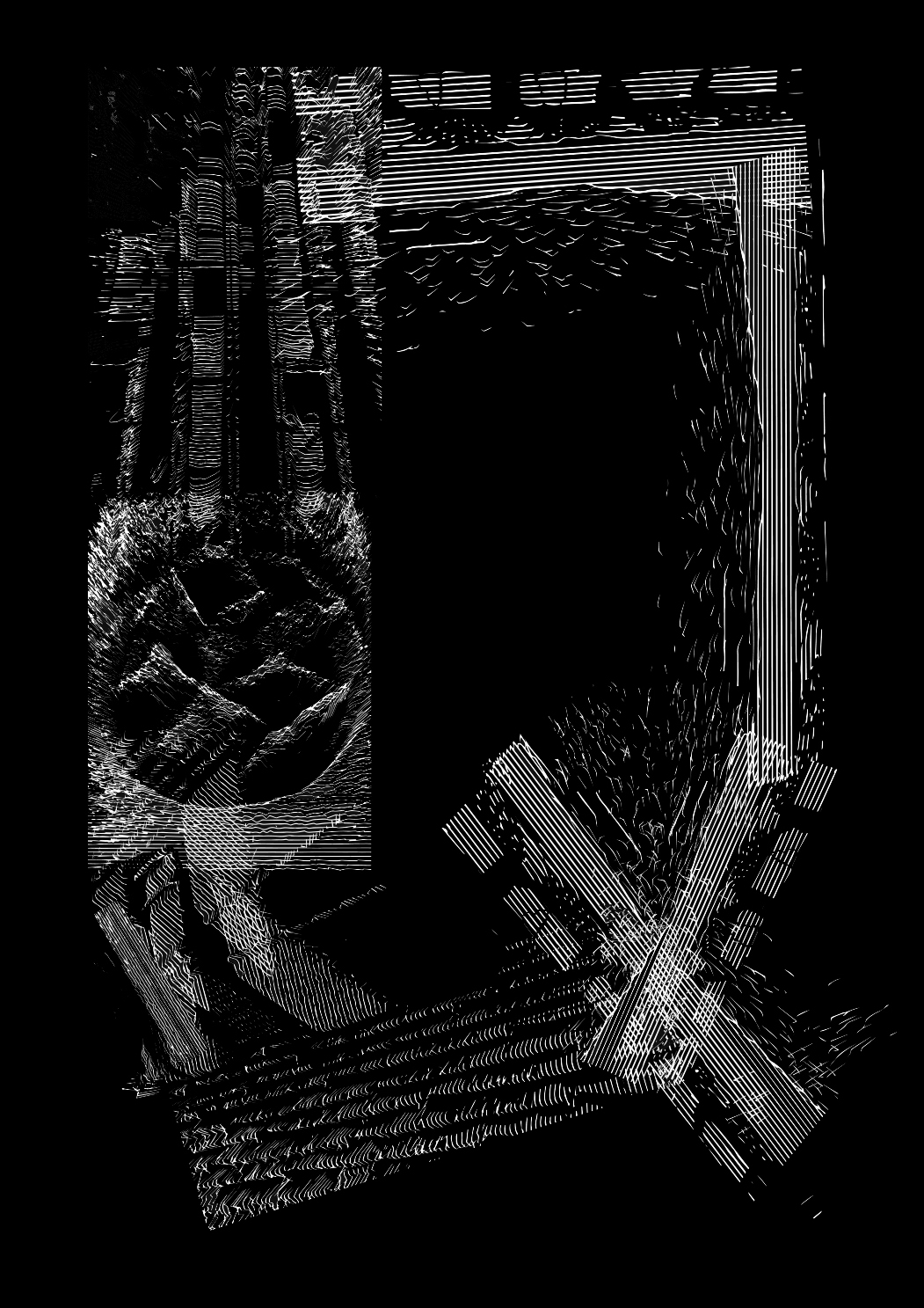
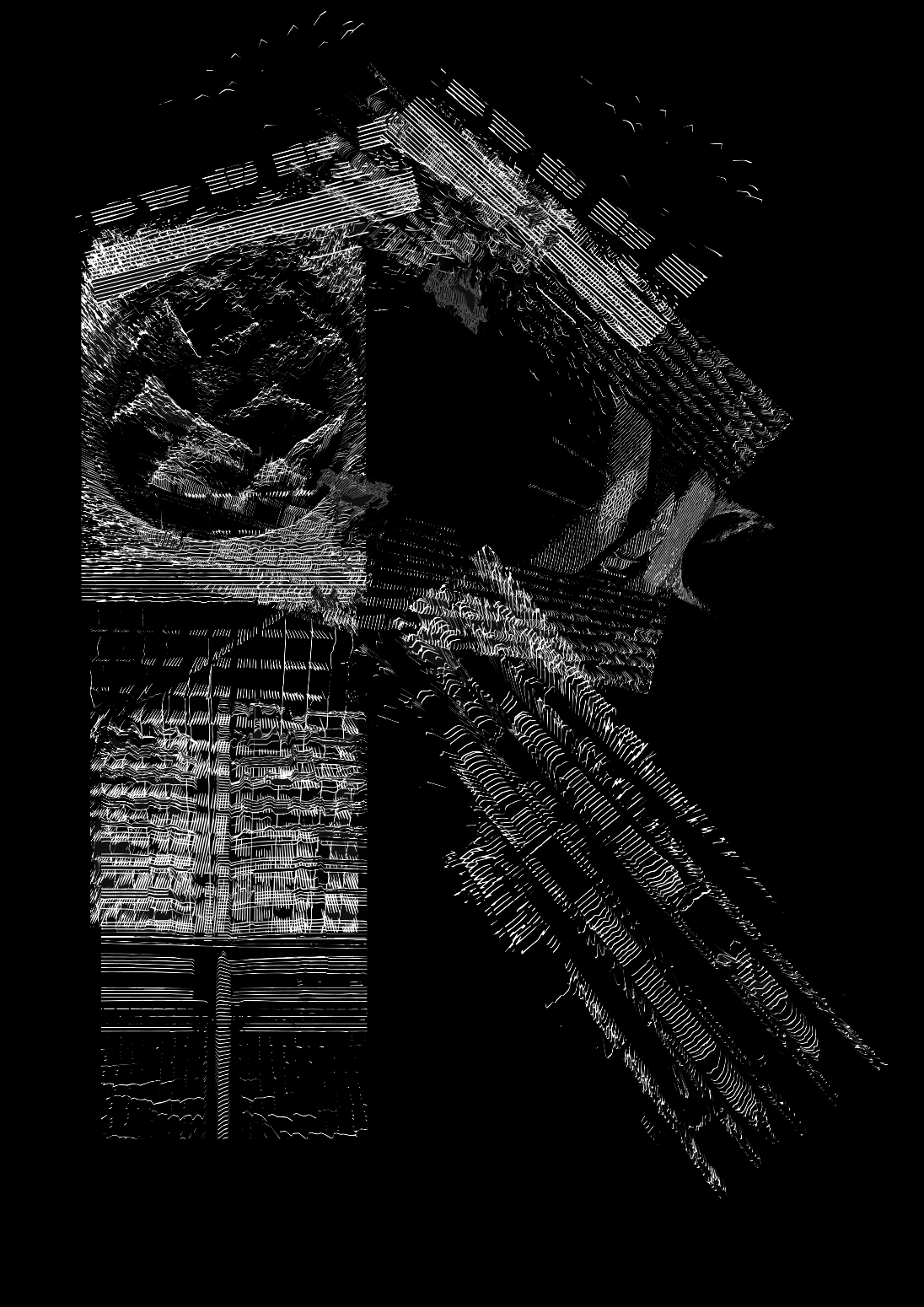
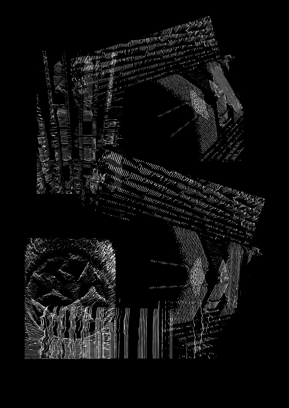
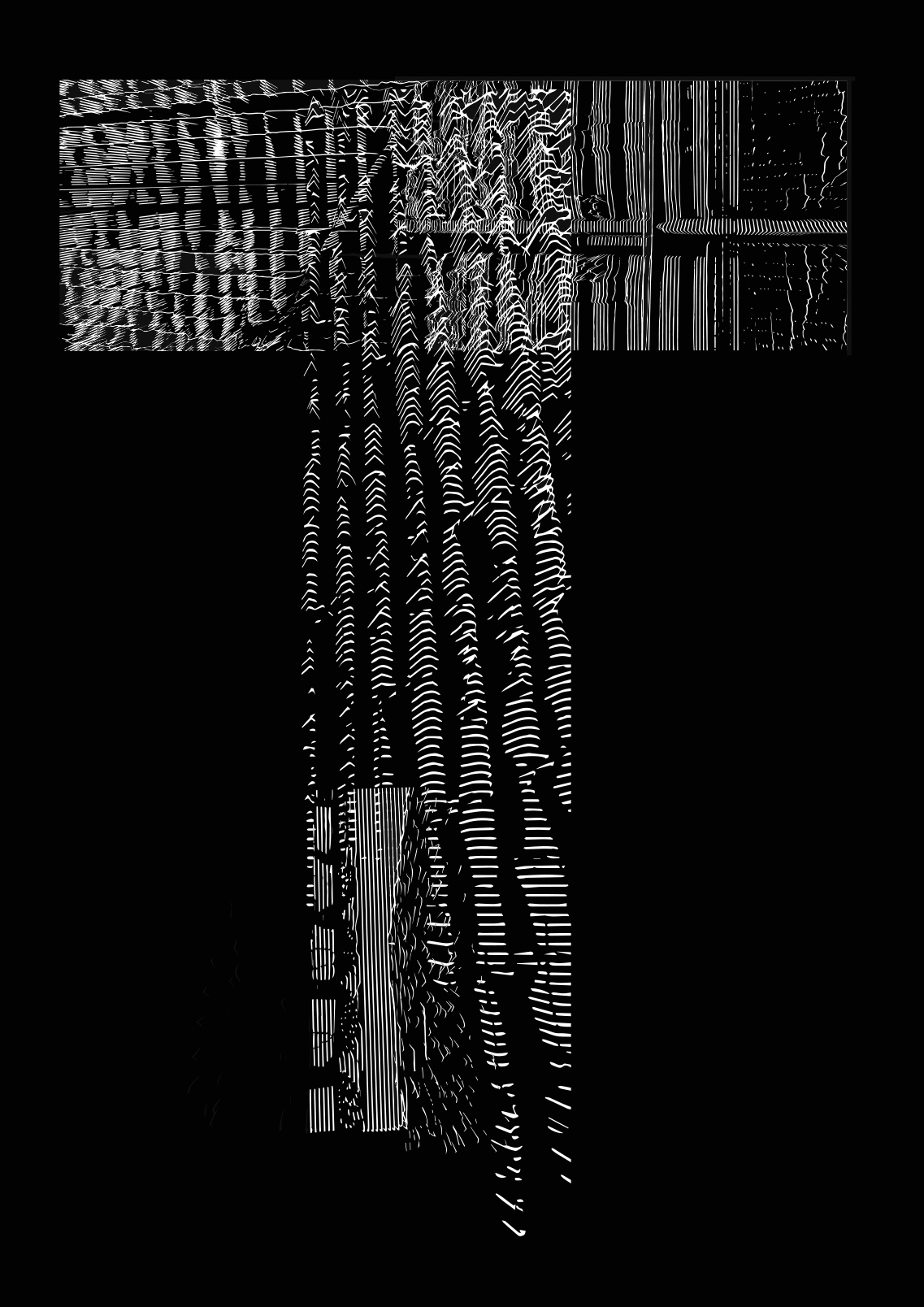
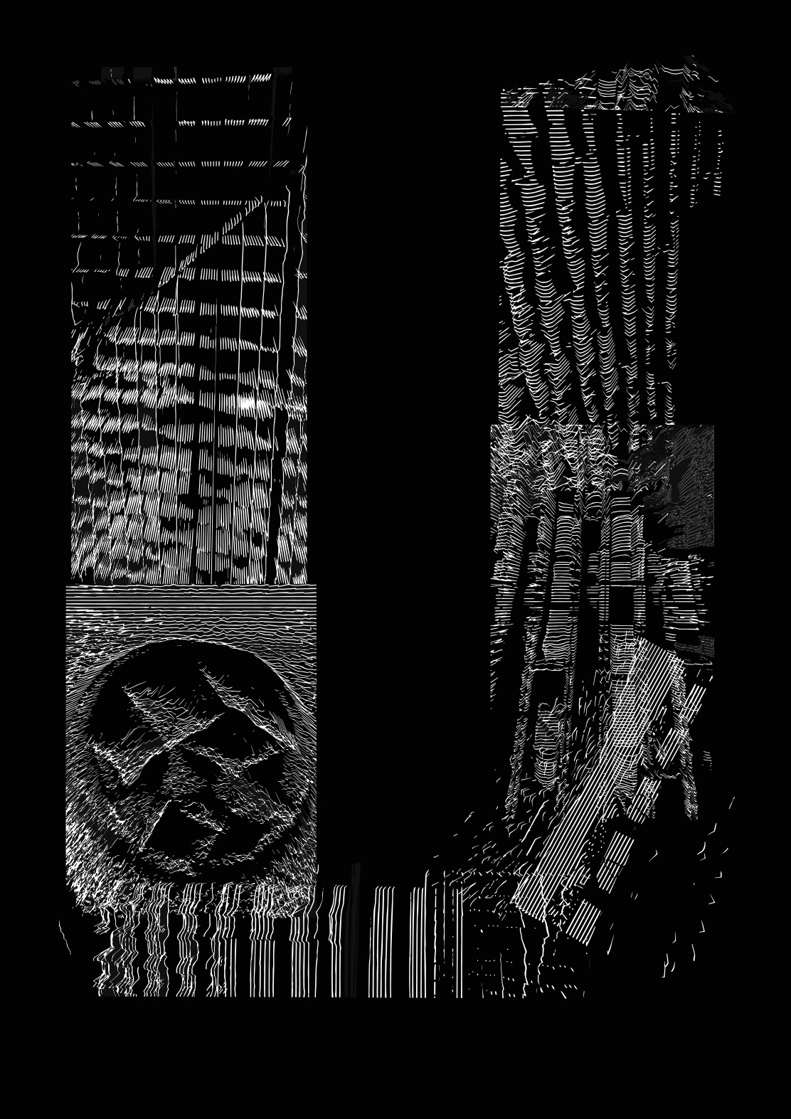
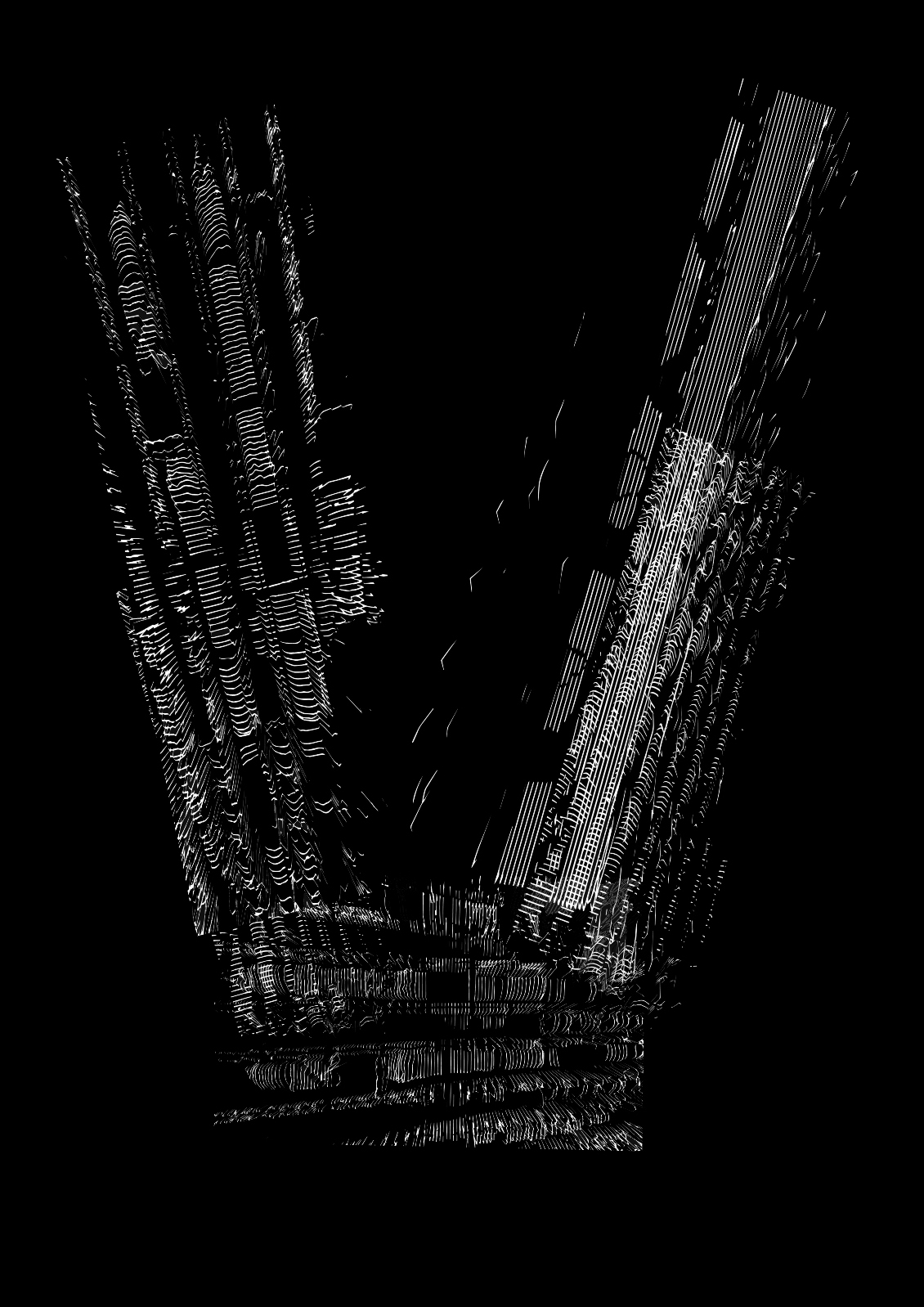
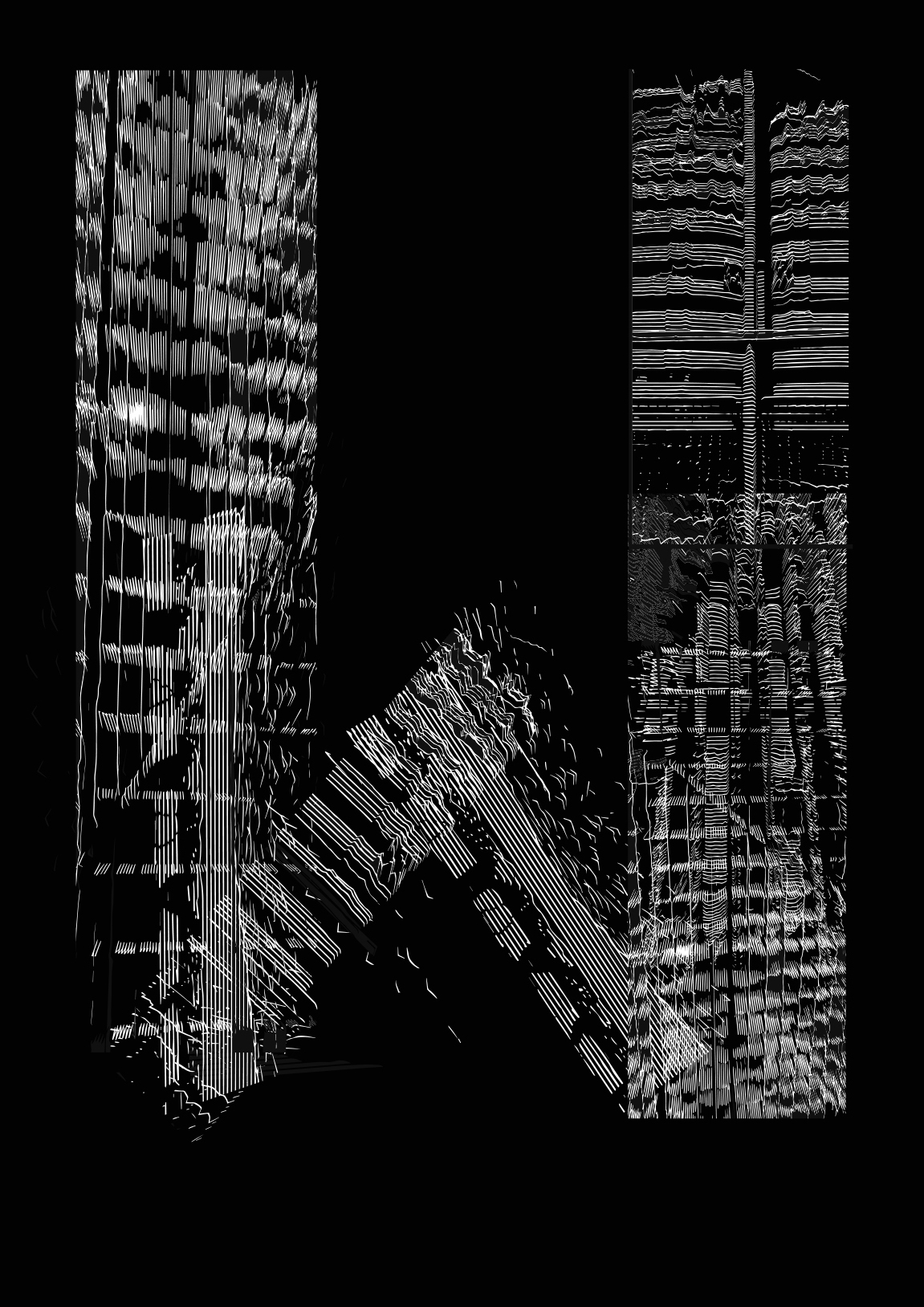
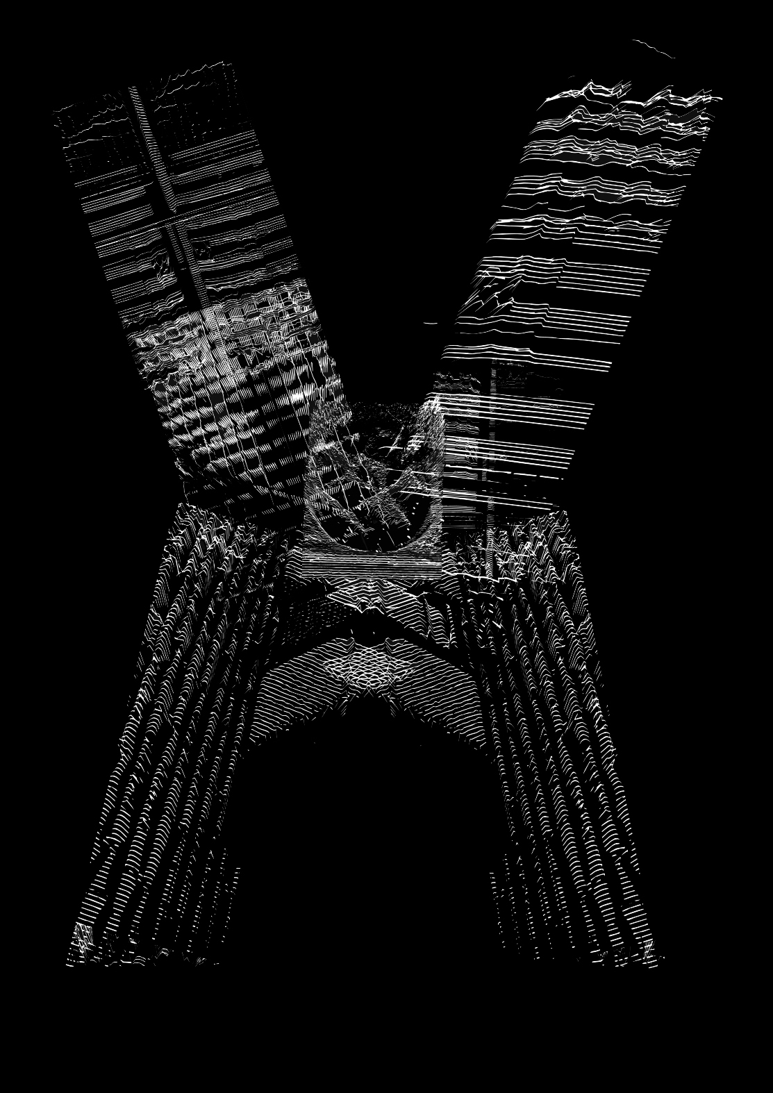
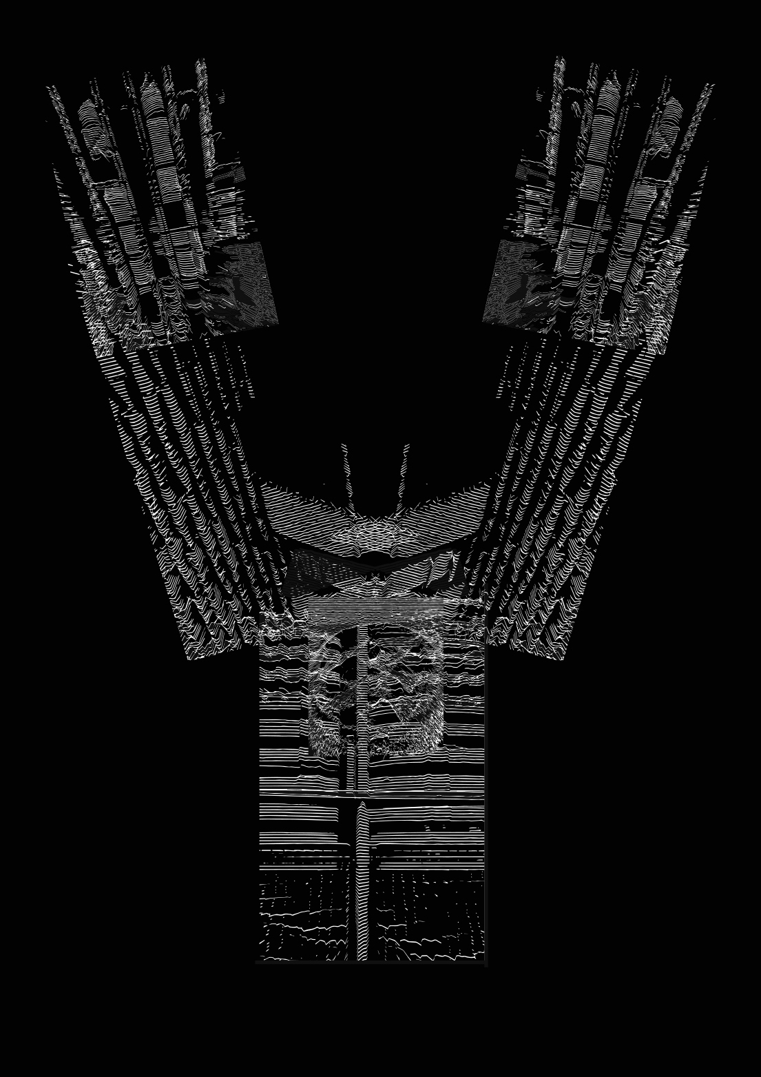
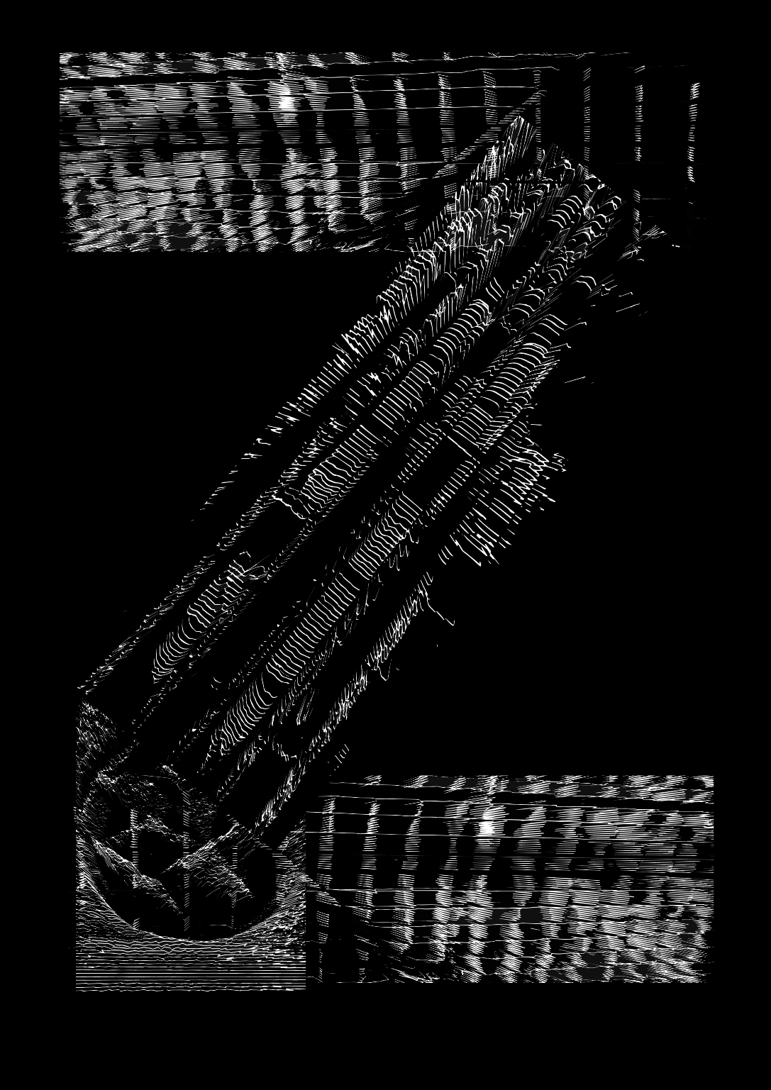
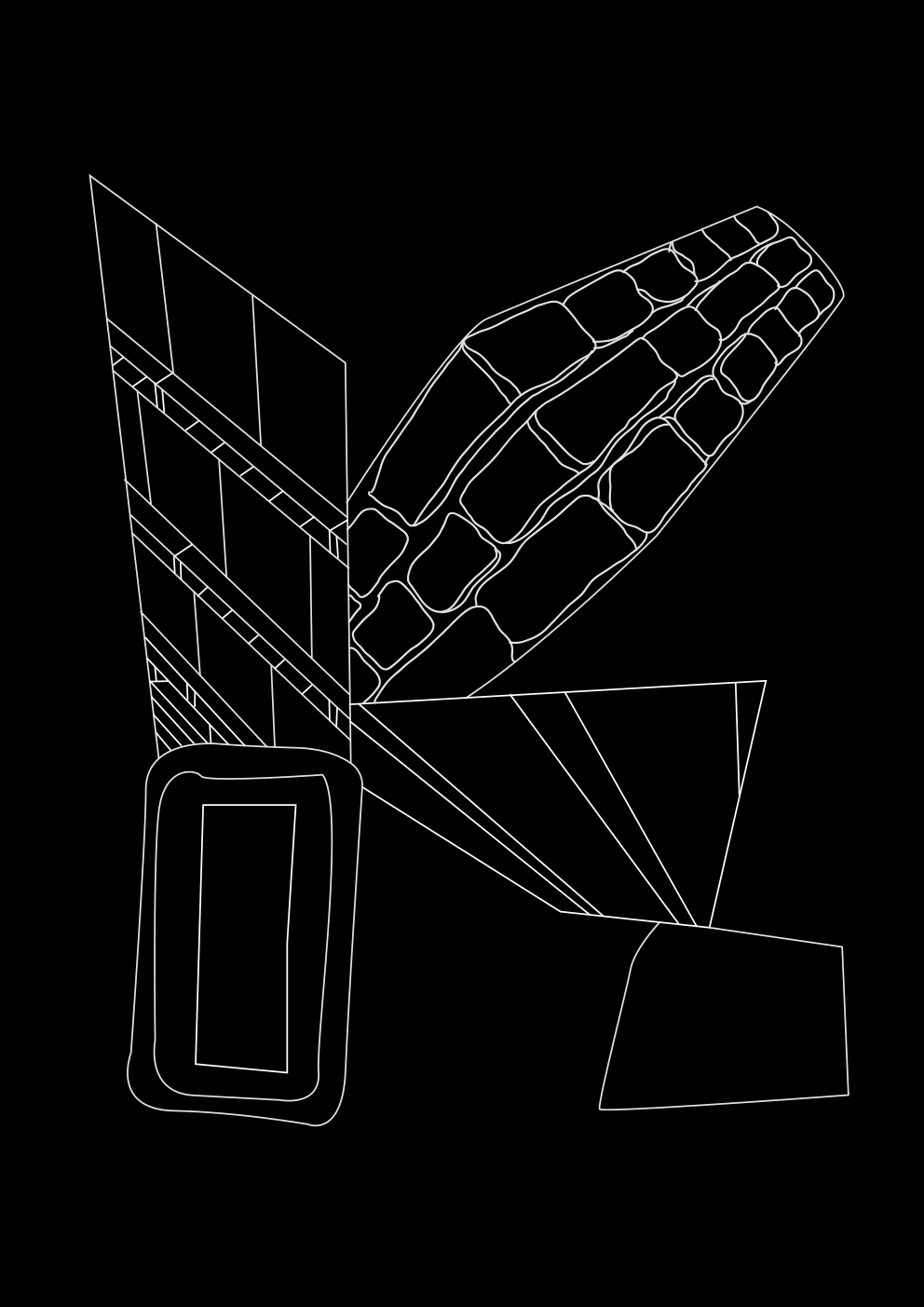
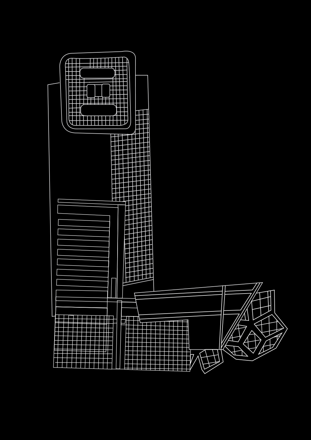
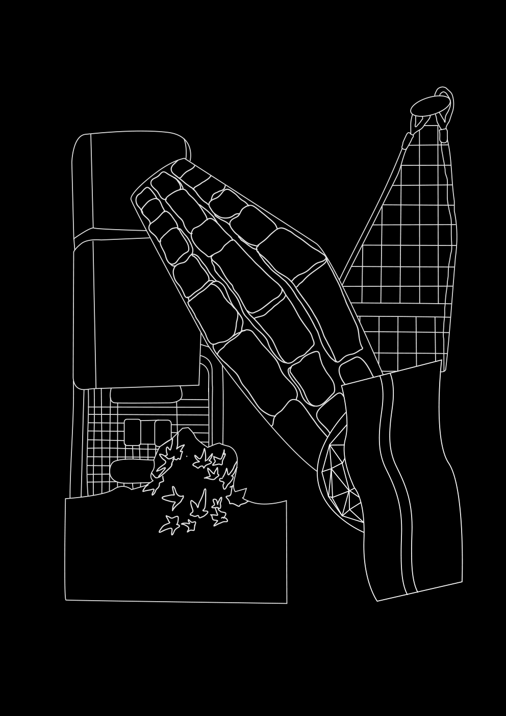
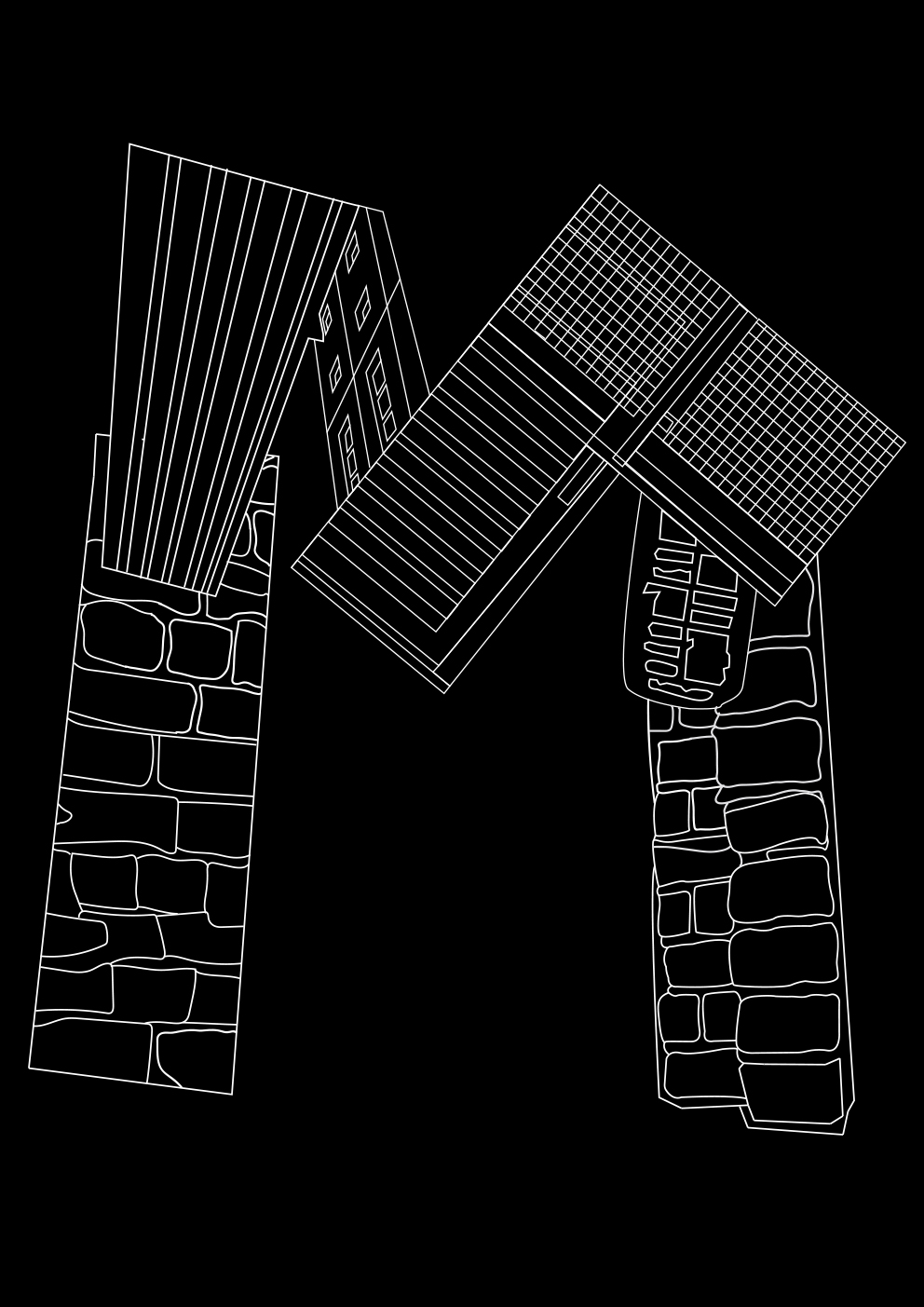
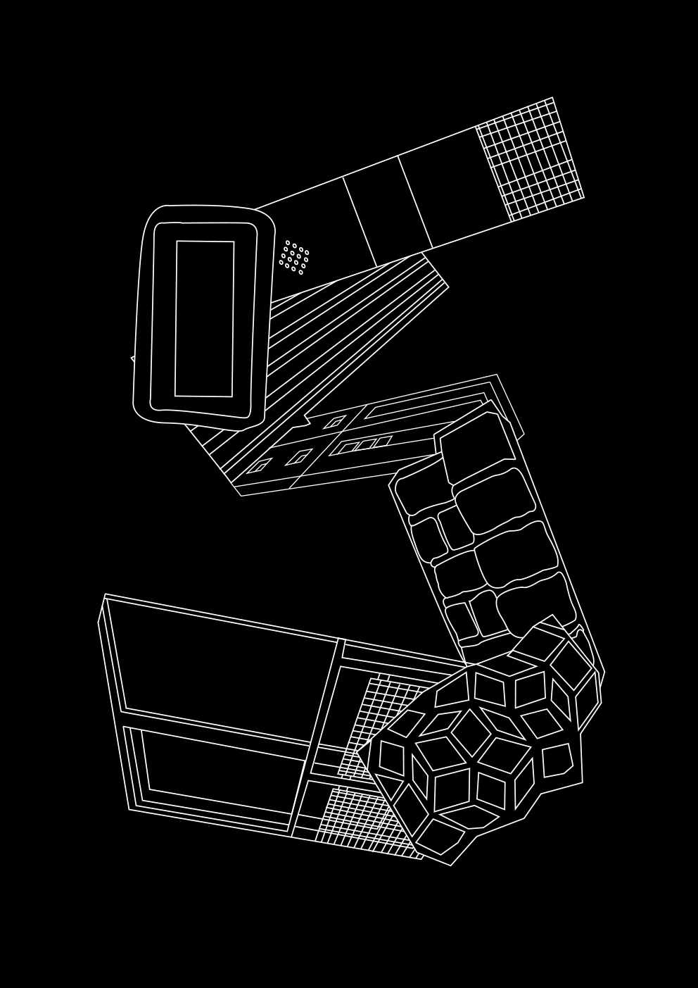
While doing visual research, I developed two fonts. The lower one is a straightforward solution, where, having redrawn the collected textures from the street, I began to build letterforms, and the upper one is the method, but on a more poetic level - I created the same textures consisting of many lines, as if creating "urban fibers", weaving around the structures of buildings.
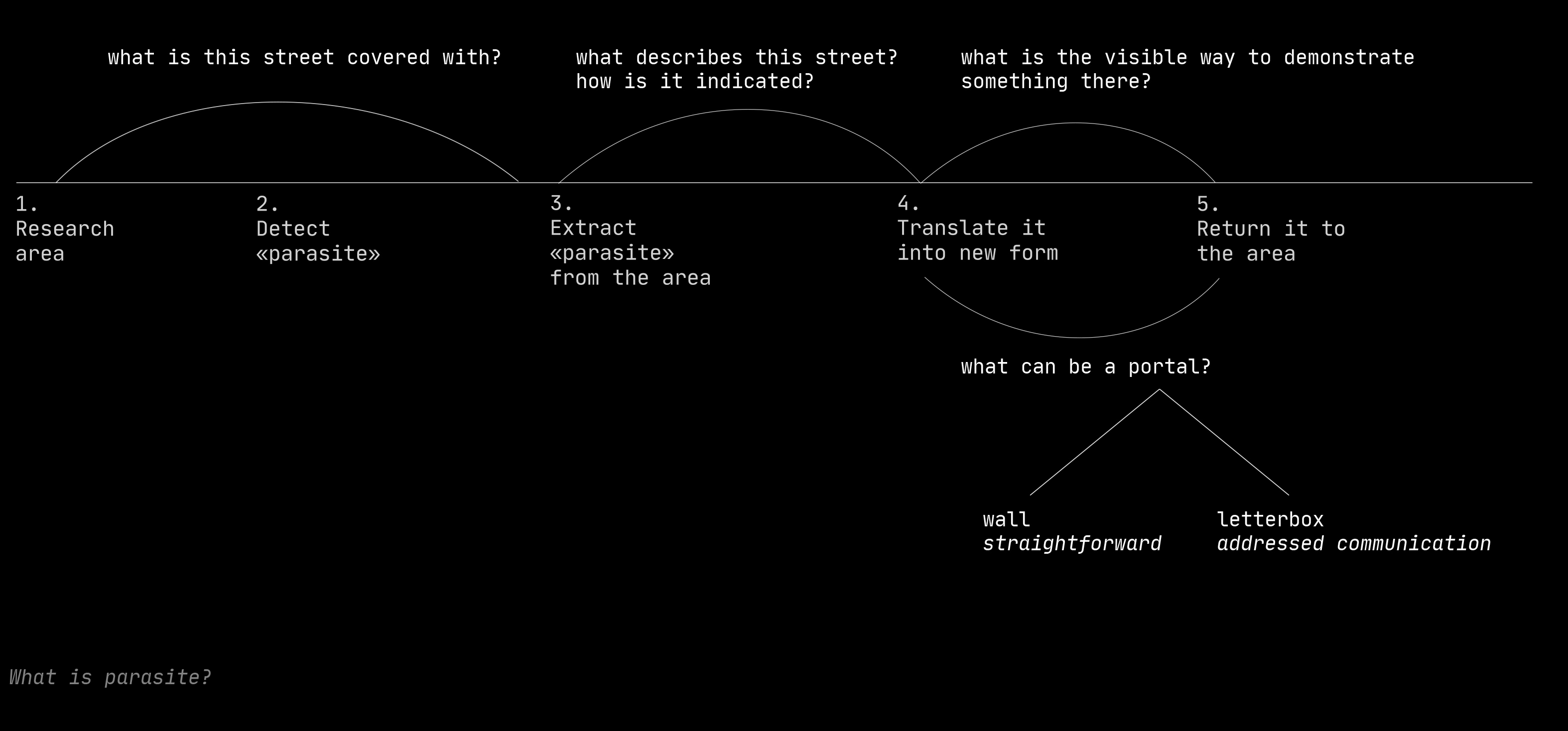
My aim was not only to make the font, but also to bring it back to its habitat. After research, I realized that distributional portals of my font can be post mailboxes, being implemented practically in every door, and also the walls these textures were extracted from. For communication through the mailbox, I made an abstract speculative newspaper and for walls - two posters. Check them here.
Research scheme:
![]()
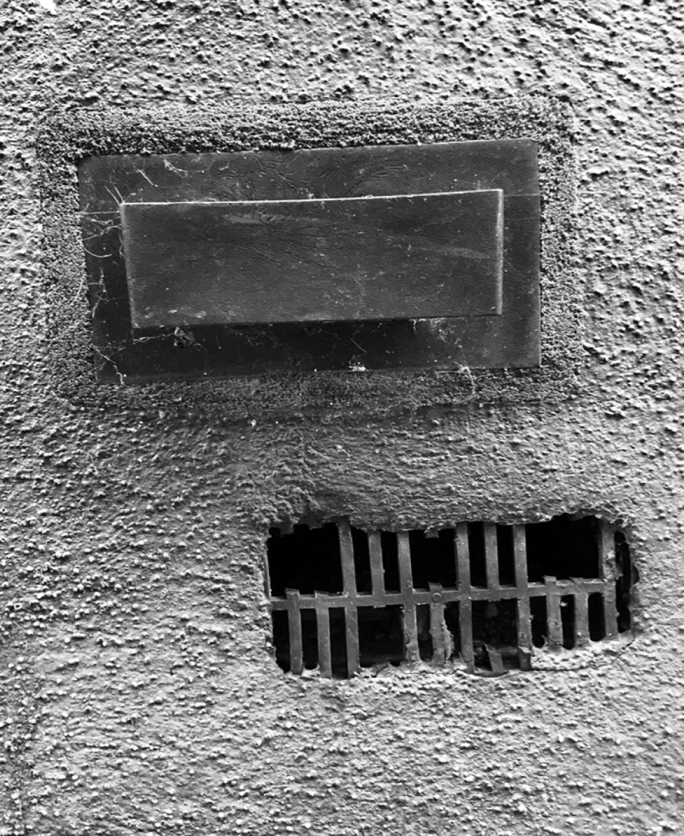
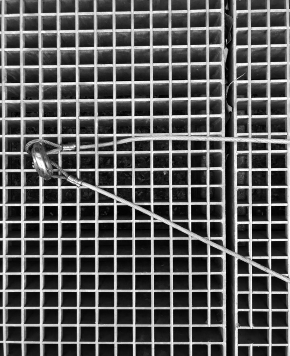
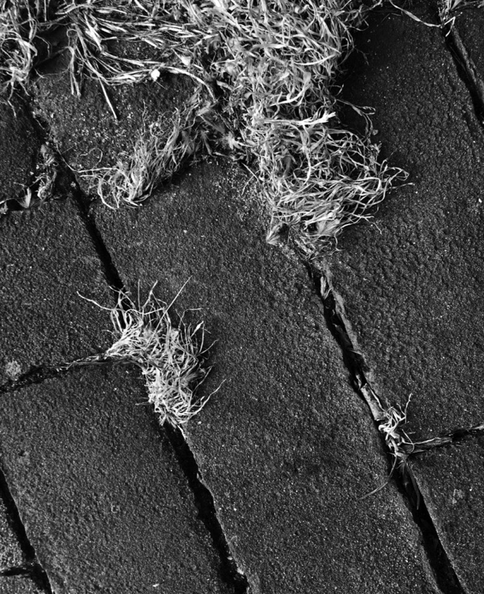
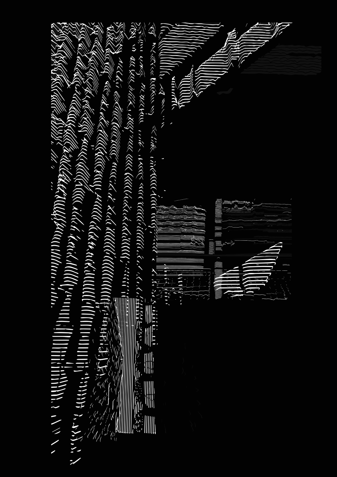
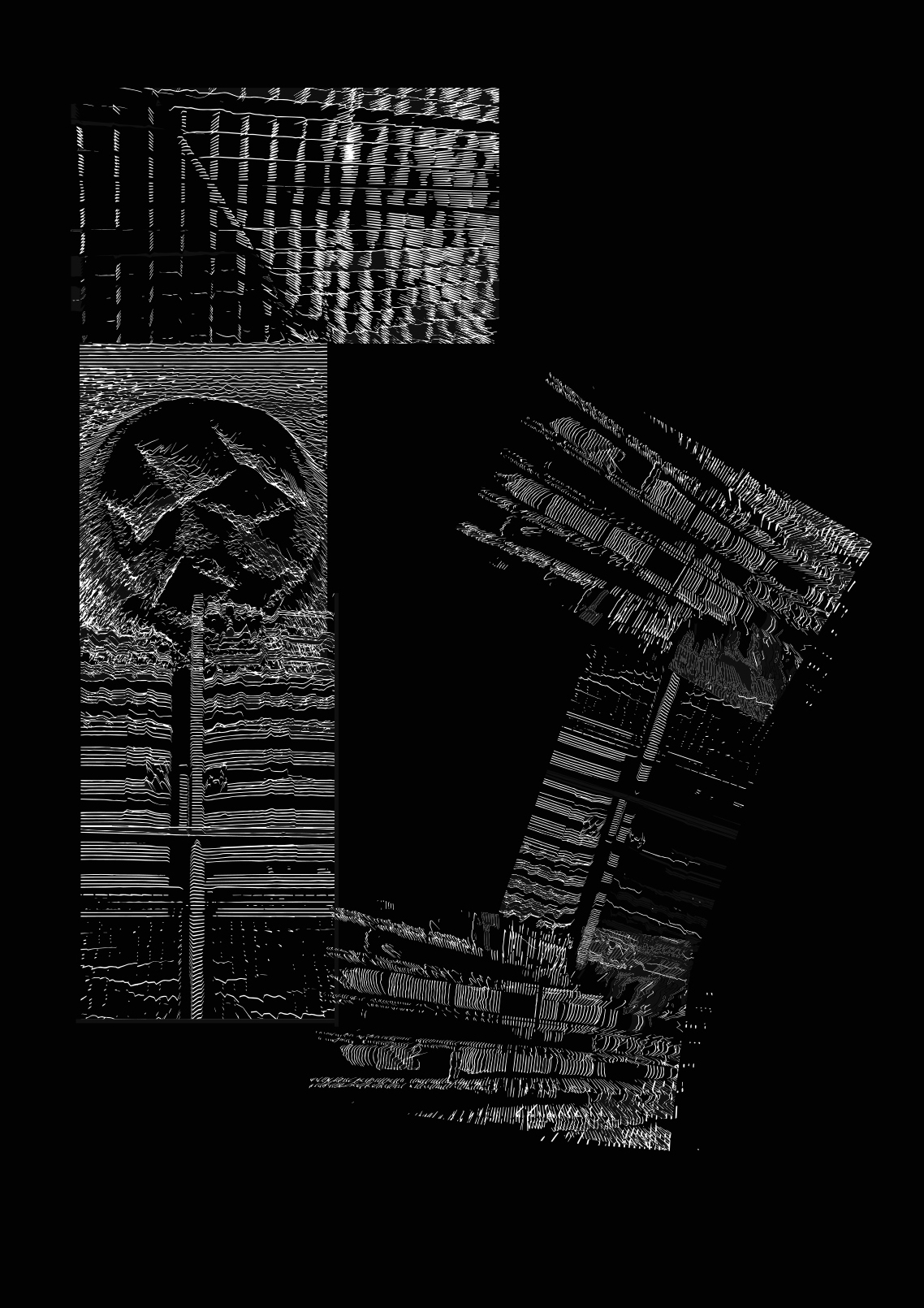
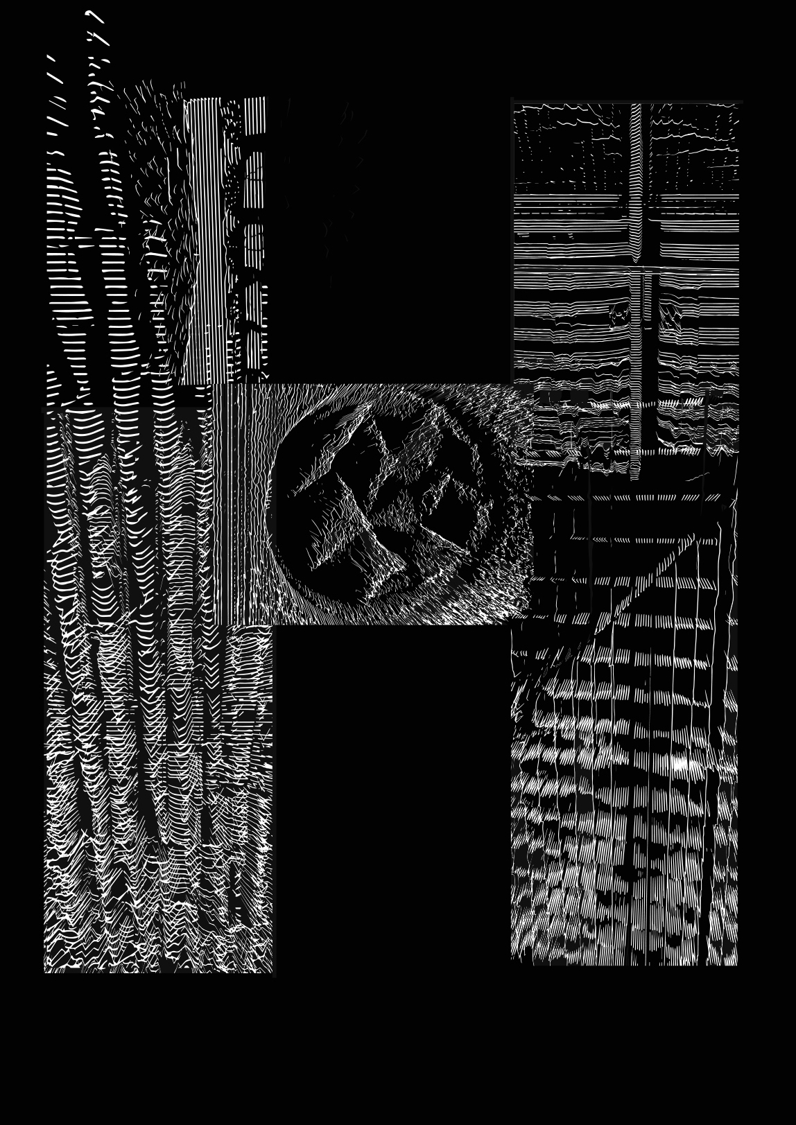
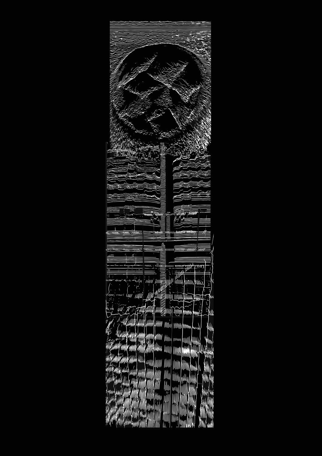
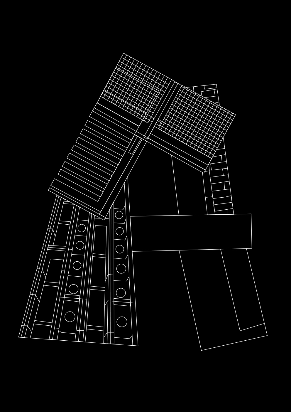
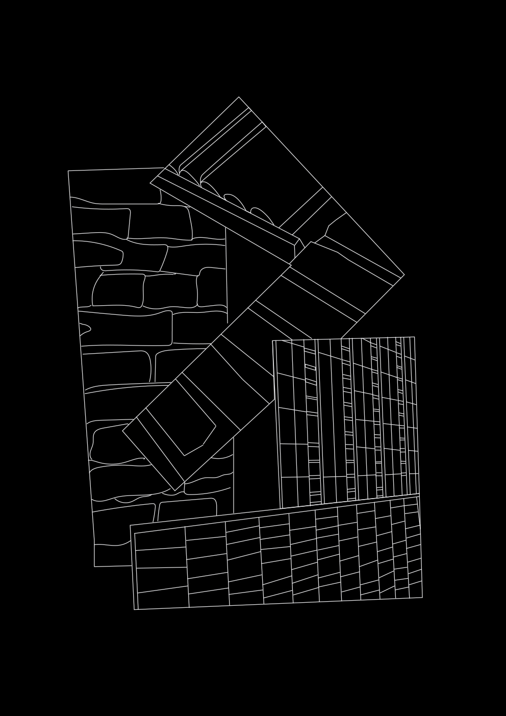
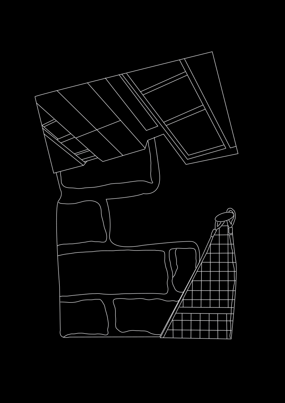
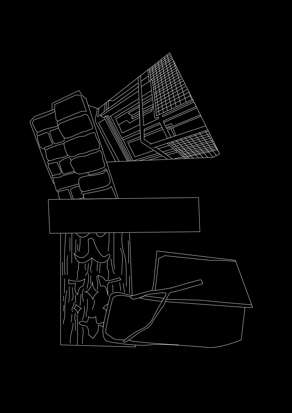
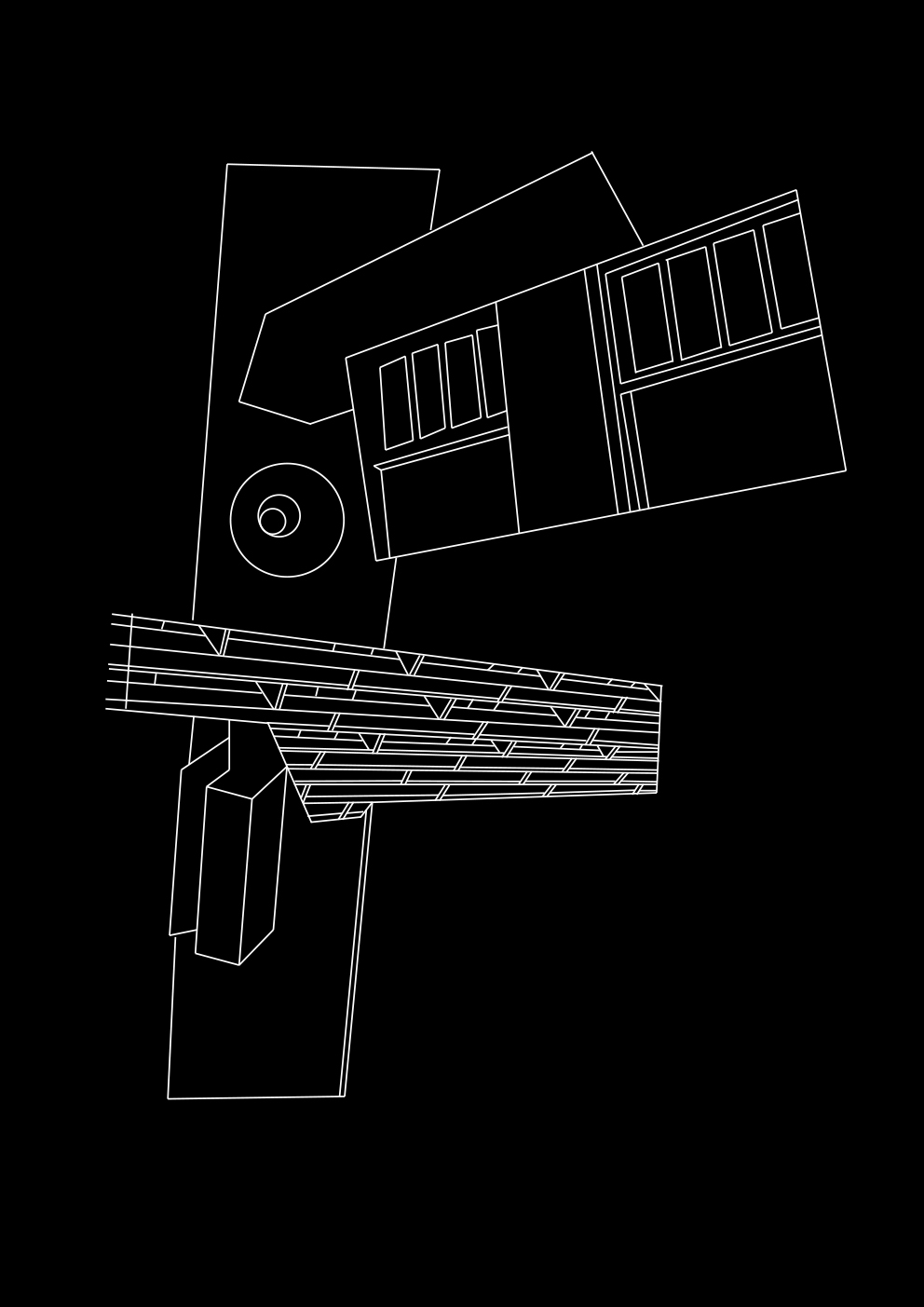
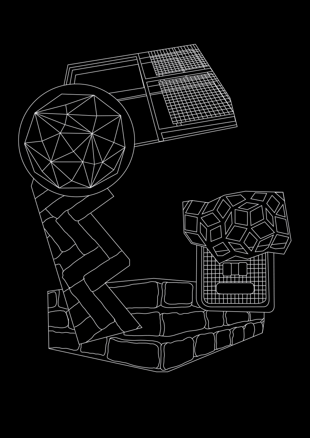
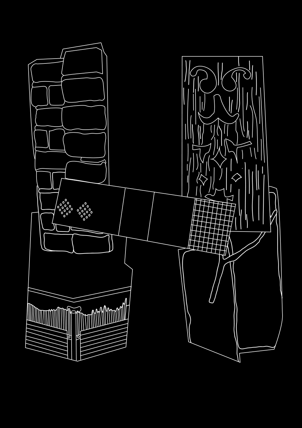
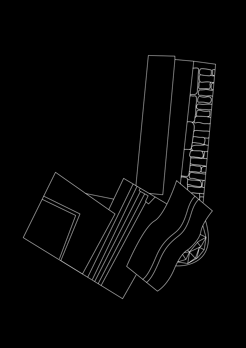
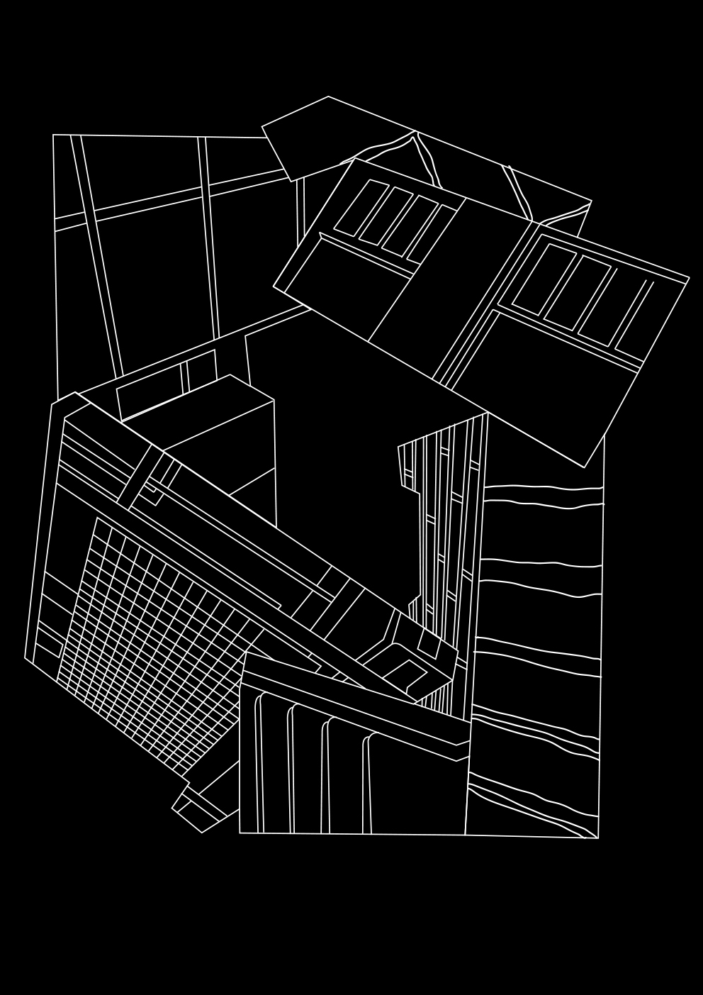
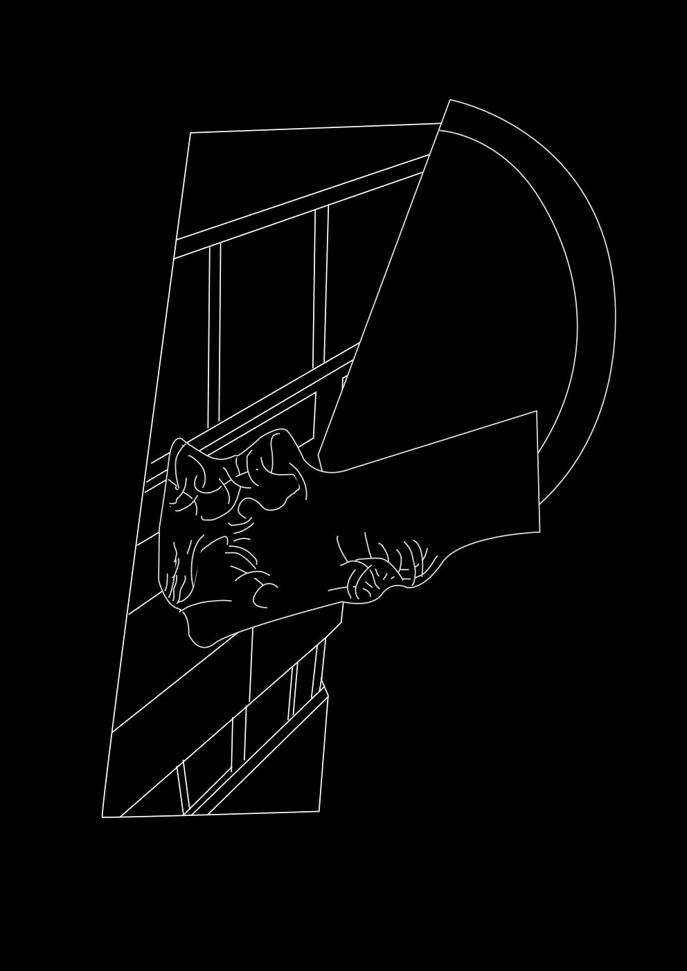
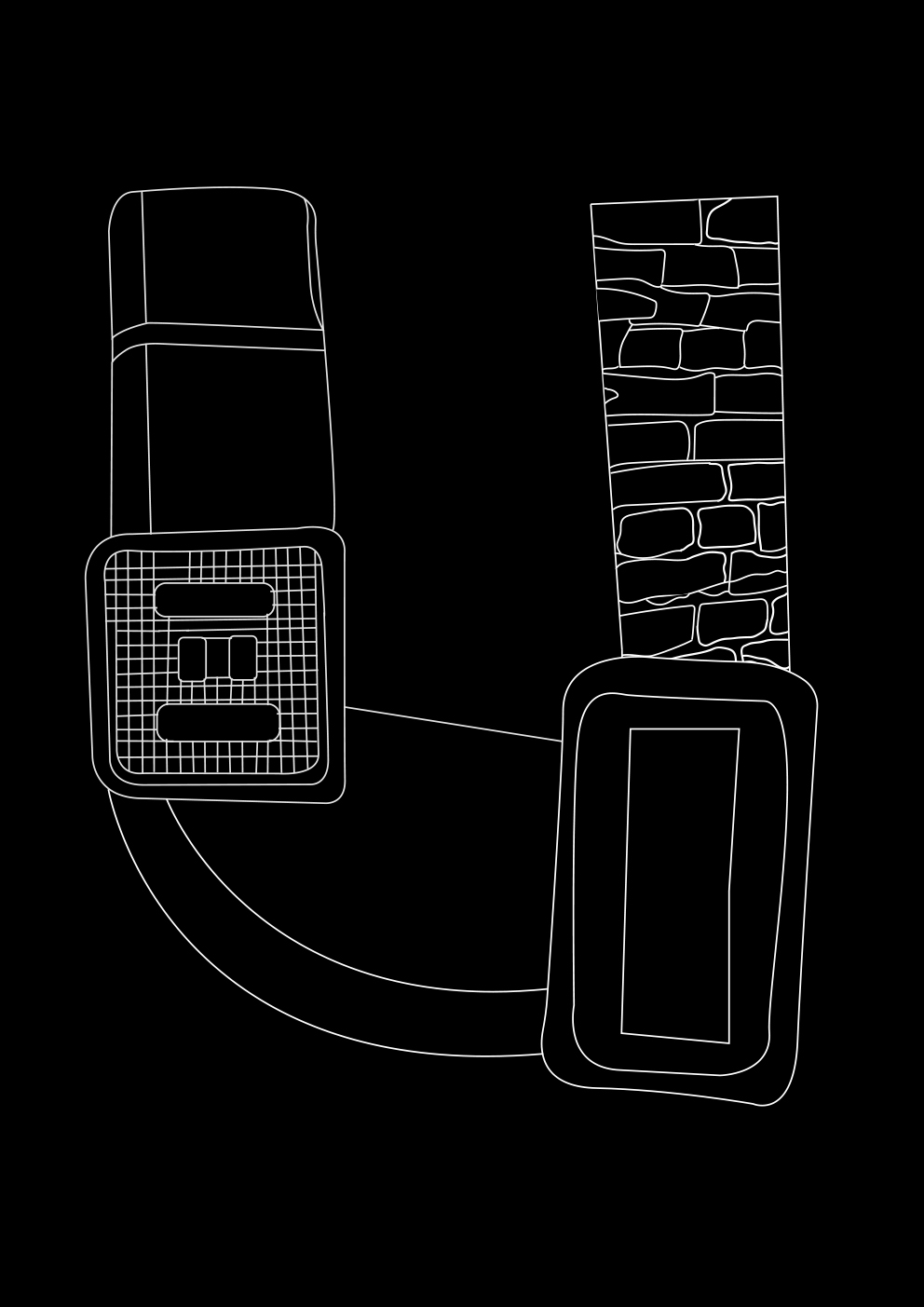
Examples of texture research from the location:
![]()
![]()
![]()
![]()
![]()
![]()
![]()
![]()
A parasite is an organism that lives on or inside a host and receives food from or at the expense of the host, being inspired by this apparently biological fact, I started to think how to translate this to graphic design. Every day I was passing through the next to my house street(simply, grocery shop was there), I started to notice how this street is covered with textures, located on absolutely different in style buildings - that was the moment I realized that the cladding of the buildings is the very parasites that I am looking for! Plenty of signs on this street led to the idea of creating a type out of them.
While doing visual research, I developed two fonts. The lower one is a straightforward solution, where, having redrawn the collected textures from the street, I began to build letterforms, and the upper one is the method, but on a more poetic level - I created the same textures consisting of many lines, as if creating "urban fibers", weaving around the structures of buildings.
My aim was not only to make the font, but also to bring it back to its habitat. After research, I realized that distributional portals of my font can be post mailboxes, being implemented practically in every door, and also the walls these textures were extracted from. For communication through the mailbox, I made an abstract speculative newspaper and for walls - two posters. Check them here.
Research scheme:
Examples of texture research from the location: